Guest Post: Philip Gough, Jane Austen Illustrator ~ by Hazel Mills

Gentle Readers: I welcome today, Hazel Mills, who has most generously written a post about one of Austen’s many illustrators, Philip Gough. I had written two posts on Gough [see below for links] but little was known about him personally. Hazel has done some extensive research into his life and works, and she shares this most interesting information with us here. Thank you Hazel!

***************

Philip Henry Cecil Gough

by Hazel Mills

          The artist, Philip Henry Cecil Gough, was born on the 11th June 1908 in Warrington, Lancashire, England, the eldest of four children. He was born to Cyril Philip Gough and Winifred Mary Hutchings.

          Philip was from a long line of leather tanners, curriers and bark factors, the latter using bark to soften leather. His family were wealthy owners of tanneries with evidence of his father travelling abroad to the USA in 1925 on business.

          Philip’s paternal grandfather, also a Philip, had carried on the family business in Wem, Cheshire with two of his three brothers. It obviously provided a good income as all four brothers had been to private boarding schools. In 1880, the tannery company of grandfather, Philip, and his brother was dissolved and Philip continued alone.[1]

          It is Philip’s maternal side that gives us the clue to his artistic side. His mother Winifred, also born into a family of tanners, travelled to Brussels to study Art and Music before her marriage. She also played the viola in various orchestras. [2]

          Before 1914 the Gough family moved to Moore, near Runcorn in Cheshire [3] and then in 1921, at the age of 12, Philip was sent to Loretto School, just outside Edinburgh, Scotland, as a boarder.[4] On the 4th and 5th April of that year Philip assisted in the painting of the scenery in the staging of “Much Ado About Nothing” [5] in the gymnasium of the school. The art master he assisted was Colonel Buchanan-Dunlop, who, during the famous ceasefire at Christmas 1914, led the singing of the carols from a sheet sent to him from Loretto School. [6]

          Again in 1924, Philip painted scenery for the school production of “A Midsummer Night’s Dream”, which was performed in aid of the Edinburgh Royal Infirmary, again assisting Col. Buchanan-Dunlop. [7]

Liverpool Art School record

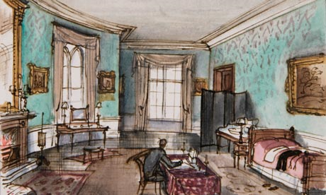
          Philip left school in 1925. [8] It is known that he attended art school in Cornwall and Liverpool. He entered Liverpool College of Art in February 1926 and a year later, while still at the college, designed the scenery for the pantomime, “Robinson Crusoe”, at the Garrick Theatre in London. In 1928, after leaving the Liverpool College of Art, he designed about 60 costumes for “A Midsummer Night’s Dream” for the Liverpool Playhouse with a photo being published in the “Graphic newspaper” on 19th January 1929 [9] It is also thought that he designed shop windows around this time.

Midsummer Night’s Dream – Gough scenery and costumes

          1929 saw Philip working on a prestigious new project. He was responsible for all the scenery and costumes for A.A. Milne’s new play, “Toad of Toad Hall” at the Liverpool Playhouse, based on Kenneth Grahame’s book, “Wind in the Willows”. “The Stage” described Philip’s work as “both novel and extremely beautiful”. [10] At this time, Philip was still only twenty one years old. A.A. Milne also wrote a play of “Pride and Prejudice” called “Miss Elizabeth Bennet”. This was also produced at the Liverpool Playhouse. But sadly it was not Philip that did the scenery for this one, but a Charles Thomas. [11]

          In September of the following year, Philip designed scenery and costumes for “Charlots’s Masquerade”, a variety show at the Cambridge Theatre in London. There is even some Pathé News footage of this in existence. [you can view it here:

****************

It must be around this time that Philip meets his first wife, Mary O’Gorman, as the London Electoral register of 1930 shows him living in what appears to be a lodging house at the same address as her. It’s not know if they were actually living together as the listing is just alphabetical. Over the next eight years Gough is involved in costume and set design for at least seven productions, the first two at the Liverpool Playhouse but the following ones were all in various locations in London.

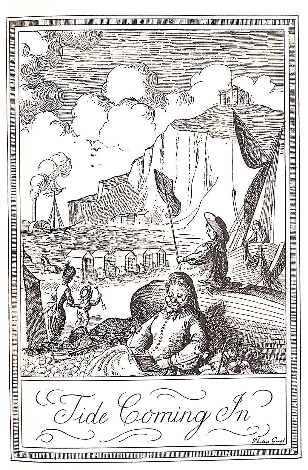
          Towards the end of this time the first book illustrated by Gough that I could find was the wonderfully named*, For Your Convenience: a learned dialogue instructive to all Londoners & London visitors, overheard in the Thélème Club and taken down verbatim by Paul Fry, [pseudonym for Thomas Burke] and published by Routledge in 1937.

“For Your Convenience”
“For Your Convenience” endpaper map

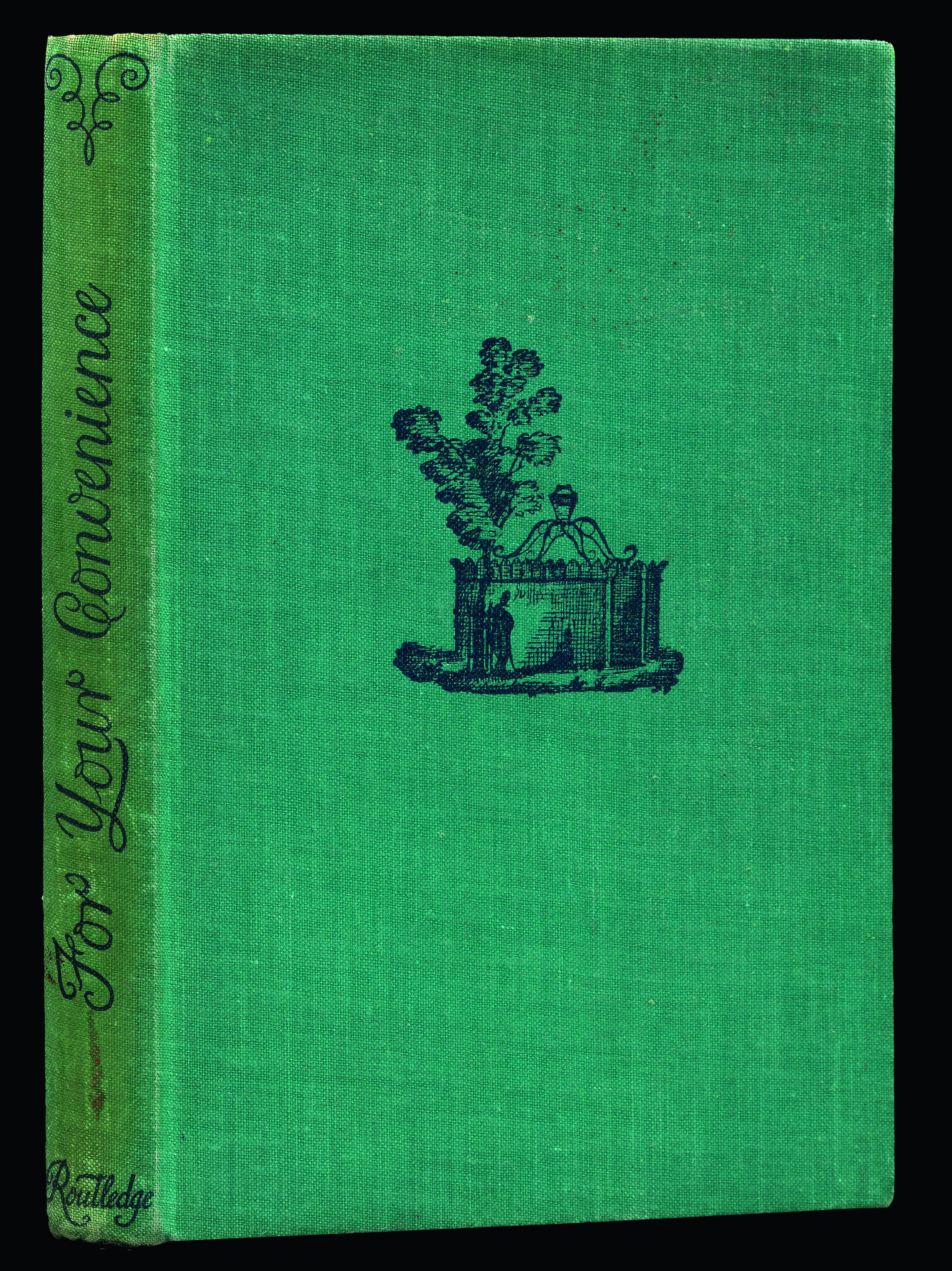
[* this book is republished today as For Your Convenience: A Classic 1930’s Guide to London Loos – in 1937 it was a heavily disguised guide to London toilets for homosexual encounters.]

***********

In 1939 Philip married Mary Catherine O’Gorman in Chelsea. The 1939 England and Wales register shows the married couple living in elegant  Walpole Street, Chelsea. The house is again the home of what appears to be boarders. Philip is described as working as an artist and designer of theatrical scenery, Mary is a secondary school teacher.

The following year Philip worked on “The Country Wife” at the Little Theatre, Haymarket, London and The Illustrated London News reported that the “décor by  Mr. Philip Gough is the chief charm of this production.” [12]

“New Book of Days”


The next few years, over the time of the Second World War, seem to be a very quiet time for Philip. I can only find his illustration of a book by Eleanor Farjeon called The New Book of Days, an anthology of rhymes, proverbial tales, traditions, short essays, biographical sketches and miscellaneous information, one piece for each day of the year. In 1936, Philip had also designed the sets and costumes for a play by Eleanor and Hubert Farjeon, called “The Two Bouquets”.

Philip’s father died in 1946 when Philip was still living in Chelsea. In 1948 he appears to have left his wife and is now living at another address in Chelsea with a Joan Sinclair.

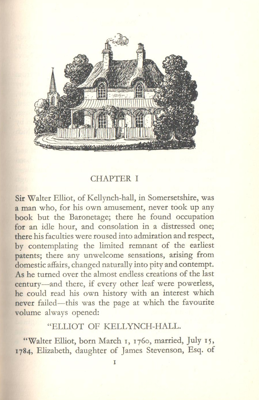
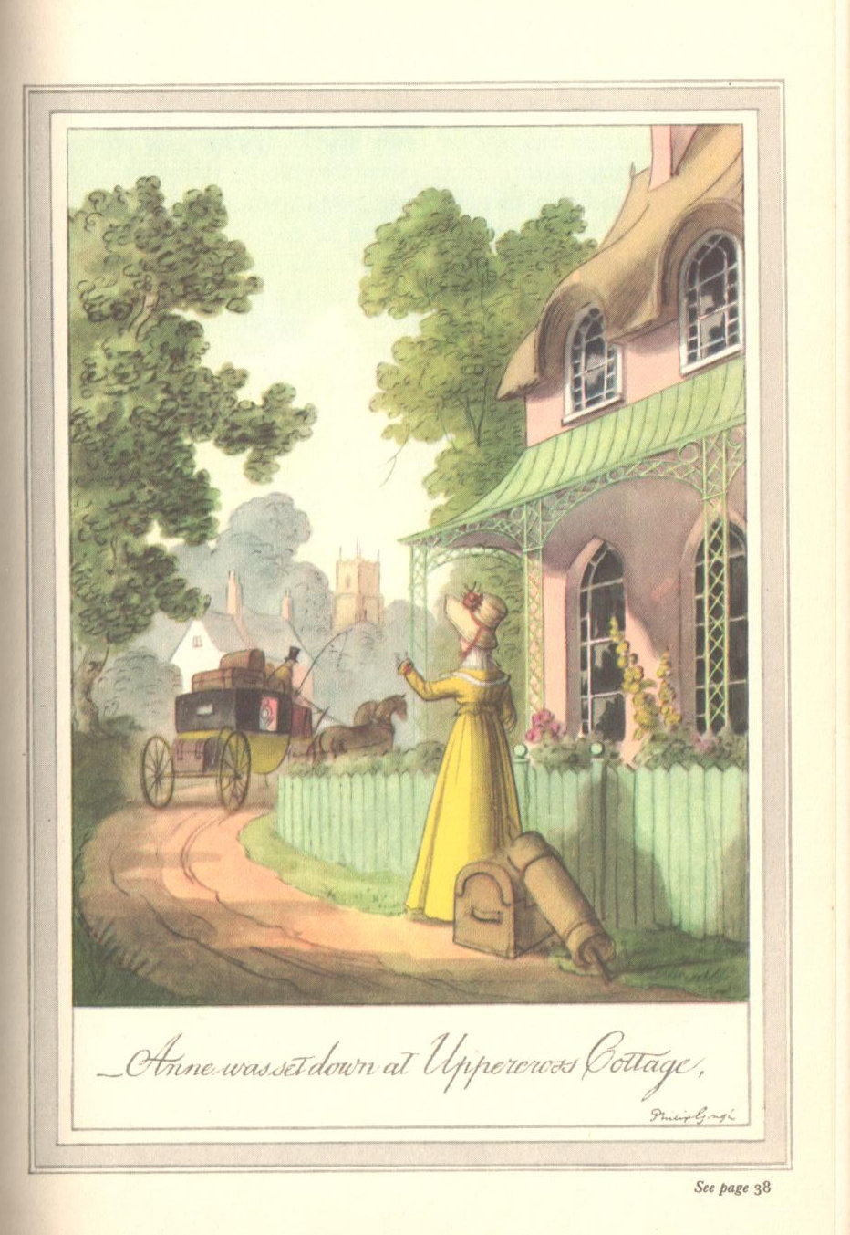
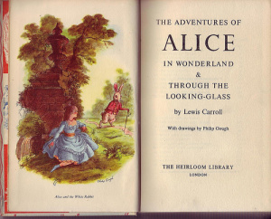
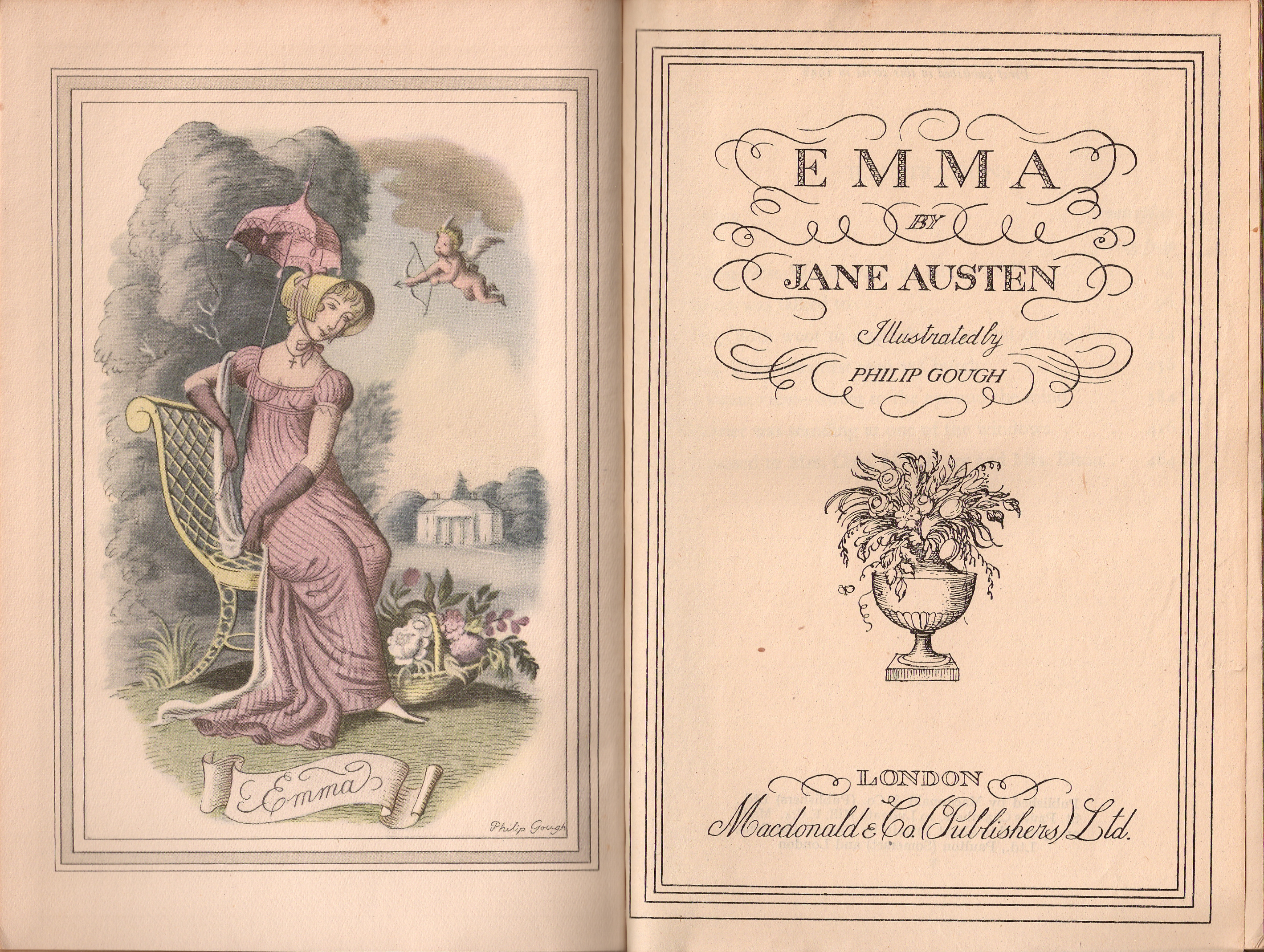
1947 was a prolific year as a book illustrator, with four books for Peter Lunn publishers including “Fairy Tales” by Hans Christian Andersen. The following year would be his foray into Jane Austen Novels with the 1948 publication of Emma, published by MacDonald for their Illustrated Classics series. 

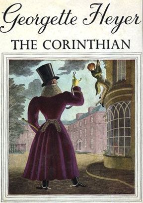
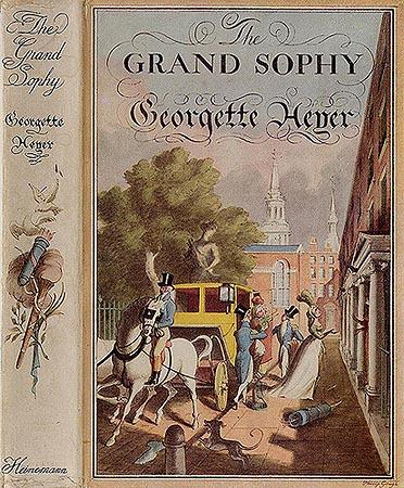
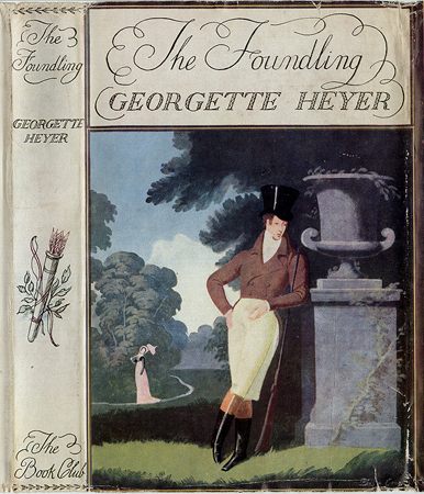
I have tracked down forty-two books between 1937 and 1973 where he drew illustrations throughout, but in addition Philip designed many, many more dust jackets for novels such as those of Georgette Heyer:

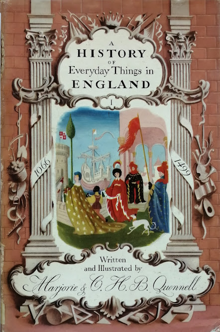
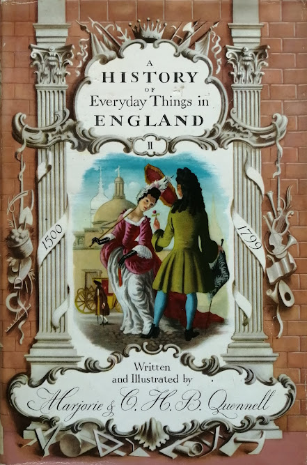
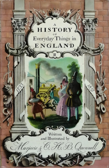
and non fiction tiles such as 1960s reprints of the four volume “A History of Everyday Things in England” that first appeared in 1918:


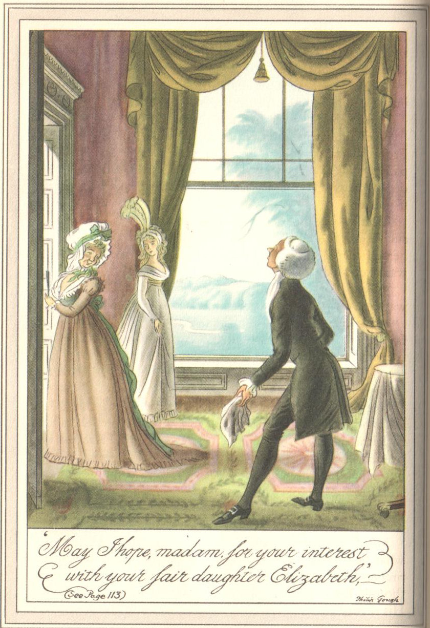
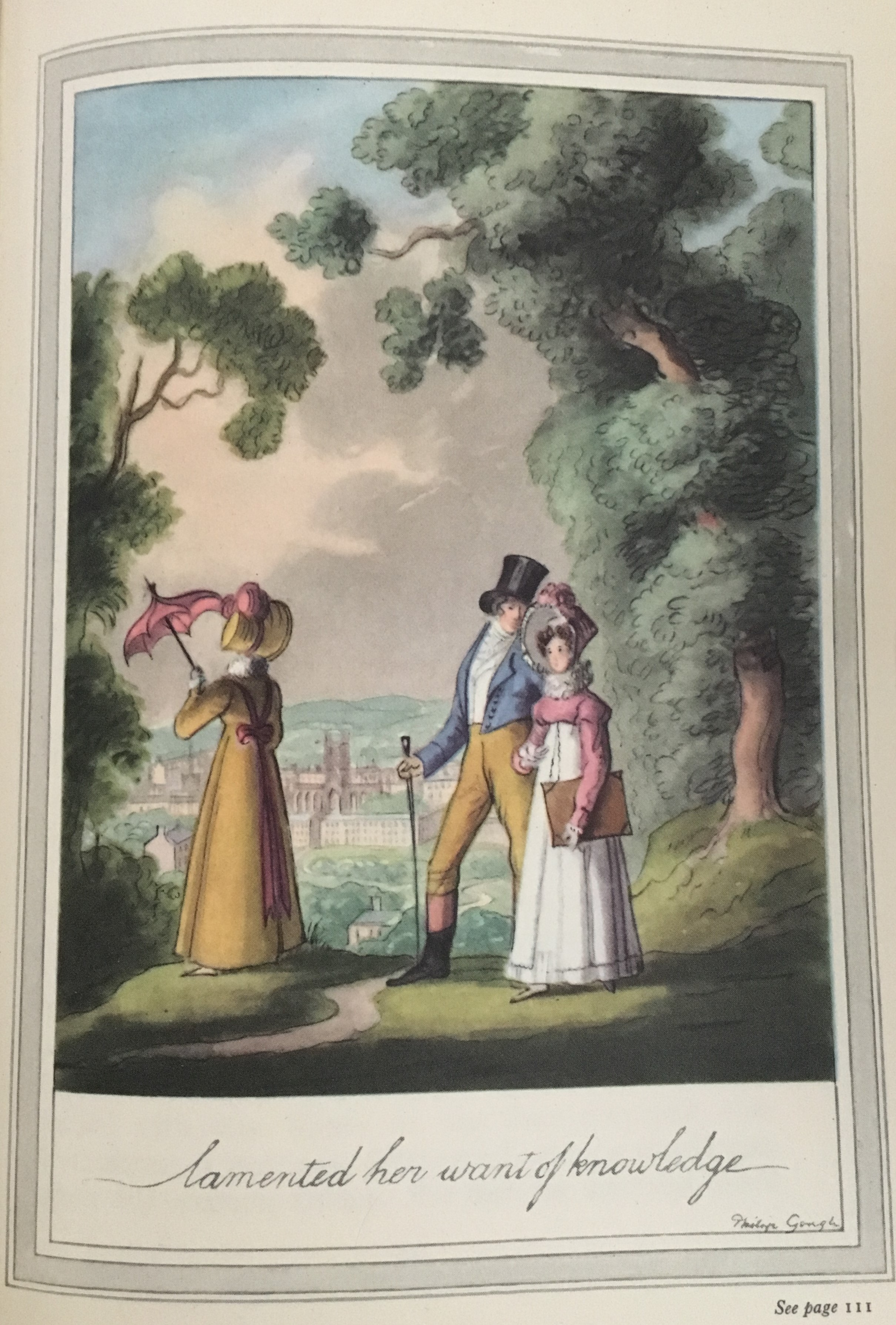
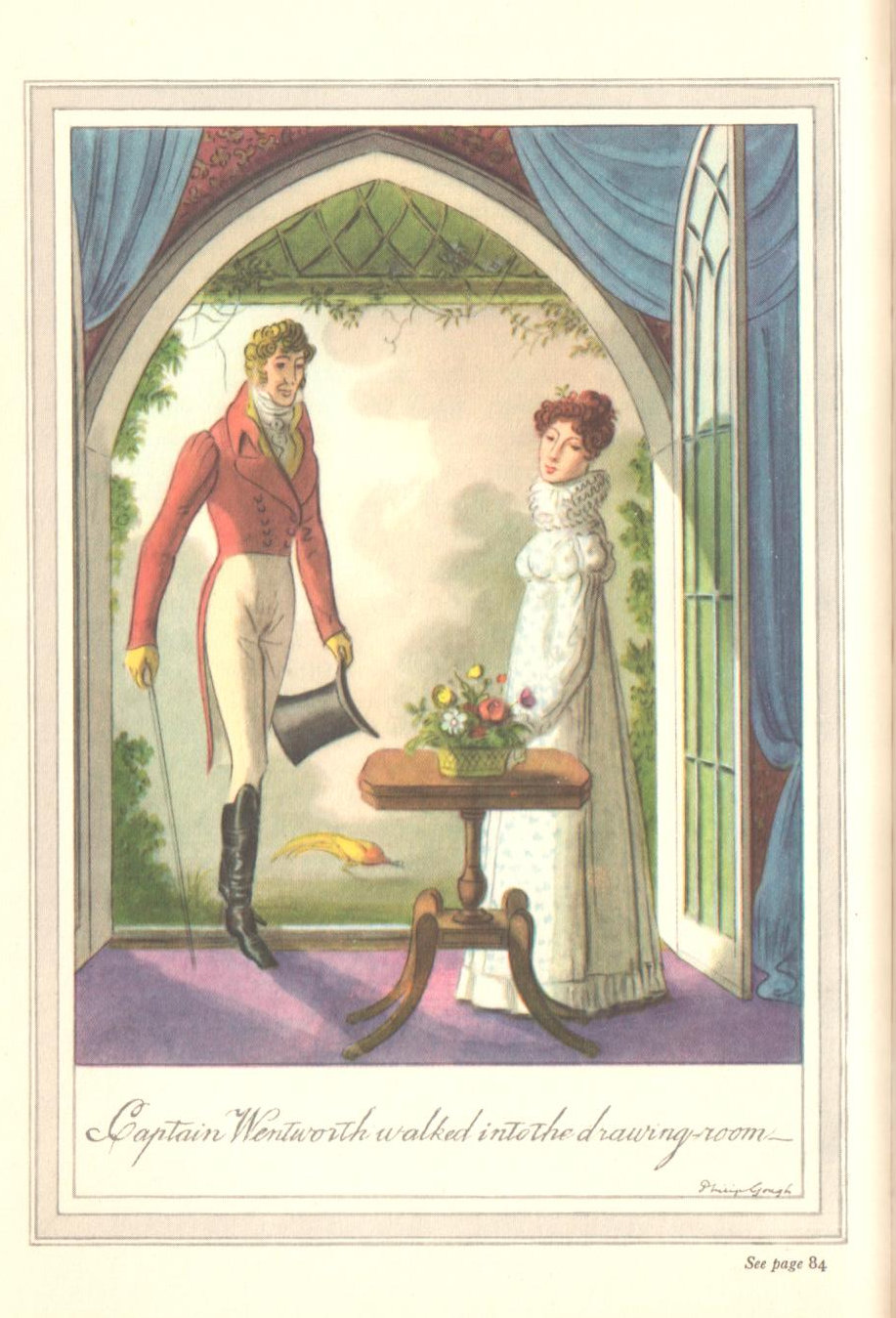
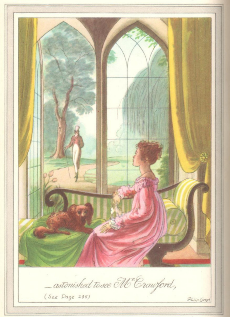
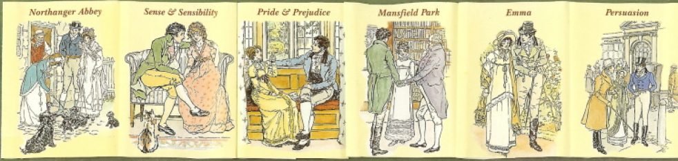
Philip also did a few more set designs in the 1950s but more of his time was spent illustrating books including Pride and Prejudice (1951), Mansfield Park (1957) and Sense and Sensibility (1958) for Macdonald. You can see many of the illustrations here:

https://janeausteninvermont.blog/2021/08/15/collecting-jane-austen-macdonald-illustrated-classics-illus-by-philip-gough/

and here:

https://janeausteninvermont.blog/2014/12/30/jane-austens-mansfield-park-in-pictures-the-illustrations-of-philip-gough/

*****************

In Philip’s personal life, tragedy hit when his mother was killed in an accident when she was hit by an army truck in 1952.  Philip married Joan in 1953 which is the last year in which I can find any more set and costume designing.

Northanger Abbey

          1961 saw the Macdonald publication of both Northanger Abbey and Persuasion with his illustrations and he continued to illustrate books until at least 1973.

          Philip Gough died in London on 24th February 1986, leaving a fortune of £42,661.

          Philip’s sisters also deserve a mention. Sheila May Gough was qualified as a nurse and during WWII joined the ‘Queen Alexandra’s Imperial Military Nursing Service’. She served in Europe before being posted to Malta.  In 1943 Malta became the base for the invasion of Sicily.  It was codenamed ‘Operation Husky’ and began on the night of 9 July and lasted for six weeks.  Sheila was awarded the ‘Associate of the Royal Red Cross’ for “special devotion to duty…and complete disregard for her own safety”. [13] Sheila remained unmarried until the age of 58, in 1975, when she married Donald Verner Taylor C.B.E. who had been in the Army Dental Corps in Malta at the same time as her.

          Less is known of his sister Gwendoline Winifred other than she was a school teacher at a boarding school in Nottingham in 1939 [14] but in 1941 sailed to South Africa where she stayed until 1946. [15] More is known of  Brenda Irene, or rather Flight Officer Brenda Irene Gough. The 1939 register records that Brenda was working as a secretary for the Civil Nursing Reserve and living in Wimbledon.  She joined the WAAF (The Women’s Auxiliary Air Force) after May 1941 .  In 1943, Brenda was promoted to Section Officer in the Administrative and Special Services Branch and later promoted to Flying Officer.  During the war women were paid two thirds of the salary of their male counterparts.

Philip Gough has left an enormous body of work and original works of his illustrations can achieve high prices today, for example, a signed original gouache artwork  for the dust wrapper to Georgette Heyer’s The Foundling currently commands a price of around $2,500.

**********************

Footnotes:

  1. The London gazette May 27 1881
  2. Obituary Cheshire Observer Dec 01 1951
  3. Kelly’s Directory 1914
  4. https://archives.loretto.com/archive/the-lorettonian/1921-vol-44/777604-1921-vol-44-0031jpg?q=gough
  5. https://archives.loretto.com/archive/the-lorettonian/1923-vol-46/777827-1923-vol-46-0026jpg?q=gough
  6. https://www.loretto.com/christmas-truce-commemoration/47361.html
  7. https://archives.loretto.com/archive/the-lorettonian/1924-vol-47/777740?q=gough
  8. https://archives.loretto.com/archive/the-lorettonian/1925-vol-48/777849?q=gough
  9. The Graphic – Saturday 19 January 1929
  10. The Stage – Thursday 26 December 1929
  11. The Era – Wednesday 9 September 1936
  12. Illustrated London News – Saturday 20 April 1940
  13. National Archives
  14. 1939 England and Wales Register
  15. UK incoming and Outgoing passenger lists

Image acknowledgements:

  • Liverpool College of Art Record -Liverpool College of Art Archives
  • Mid summer Night’s Dream Image courtesy of Mary Evans Picture Library (c) Illustrated London News/Mary Evans Picture Library.
  • For Your Convenience images – Care of Daniel Crouch Rare Books – crouchrarebooks.com

________________________________

Author bio:

Hazel Mills is a retired science teacher and a founder member and Chair of the Cambridge Group of the UK Jane Austen Society. Until her move to Denmark, she was a Regional Speaker for the Society. Hazel discovered Austen as a thirteen year old Dorset schoolgirl when reading Pride and Prejudice and fell in love for the first time with Mr Darcy. She has researched the history of Jane Austen’s time, presenting illustrated talks, around England and Scotland, on diverse subjects including: Travel and Carriages in Jane Austen’s time; the Life of John Rawstorn Papillon, Rector of Chawton; Food production and Dining; Amateur Theatricals at Steventon, and the Illustrators of Austen’s novels. She lives in a lovely house overlooking the sea with her husband who built her a library to house her extensive Austen collection, which includes over 230 different copies of Pride and Prejudice.

***************

Do you have a favorite Philip Gough illustration?? Please leave a comment below.

©2022, Jane Austen in Vermont and Hazel Mills

Collecting Jane Austen: Macdonald Illustrated Classics, illus by Philip Gough

So I am back from an RV trek up north – finally able to get to Vermont and visit with family and friends – almost SEVEN weeks with no stable or reliable internet connection on any given day – and I actually survived the deprivation. Thankfully Trooper was not writing his usual journal of this trip [ https://trooperslog.wordpress.com/  ] so did not need to be uploading all his commentary and pictures every day.

But now back home with access to my shelves and resuming posts on “Collecting Jane Austen” with a short post on one of my favorite sets of Jane Austen’s novels: The Macdonald Illustrated Classics (London, 1948-61), with illustrations by Philip Gough and introductions by various scholars for four of the six volumes.

I have written about this set before, and so direct you to that blog that focused mostly on Gough’s illustrations for Mansfield Park: https://janeausteninvermont.blog/2014/12/30/jane-austens-mansfield-park-in-pictures-the-illustrations-of-philip-gough/

I’ll repeat here the description of the set:

When Macdonald & Co. (London) published its first volume of Jane Austen’s work in 1948, Emma was the chosen work, with Philip Gough as illustrator. It was the 4thvolume in the Macdonald Illustrated Classics series. It is a small book, under 8 inches, bound in red leatherette, with a frontispiece and seven other full-page plates of watercolor drawings by Gough. There is no introduction. Macdonald published its next Jane Austen novel in this series in 1951 – Pride and Prejudice, with illustrations again by Gough and again no introduction.  If you are lucky enough to have all the six volumes published by Macdonald, you will see that they appear to be a set, all with the same binding and all illustrated by Gough – but they were published over a period of years from 1948 to 1961 as follows – with the No. in the Macdonald series in ():

  • 1948 – Emma (No. 4)
  • 1951 – Pride & Prejudice (No. 23)
  • 1957 – Mansfield Park (No. 34); introduction by Q. D. Leavis
  • 1958 – Sense & Sensibility (No. 37), with Lady Susan and The Watsons; intro by Q. D. Leavis
  • 1961 – Northanger Abbey (No. 40); intro by Malcolm Elwin
  • 1961 – Perusasion (No. 41); intro by Malcolm Elwin

Not sure why Leavis did not do the other introductions – her essays on Jane Austen are magnificent, and a definite must-have for your Austen library. Her Mansfield Park introduction, after stating that MP is “now recognized as the most interesting and important of the Austen novels,” gives us a brief summary of Austen’s life and times, then writes of her theories that Lady Susan is the matrix of Mansfield Park, that Austen was “soaked in Shakespeare,” that the Sotherton sequence  is one of the “most remarkable in any English novel” where all the action is symbolic and how its pattern of events is “exactly and awfully repeated” in the final outcome of the book, and finally how Mansfield Park is really a tragedy “in spite of the appearance of a happy ending.”

All of the novels were published with a stiff clear mylar wrapper with the title and “Illustrated by Philip Gough” in mustard yellow, and “By Jane Austen” in blue, with nothing on the spine but the gilt titles on the red backstrip showing through. These wrappers are nearly impossible to find. I only have the one for my Emma volume.

****************

There is little known about Philip Gough and I cannot find much researching the internet other than he was born in 1908, illustrated a number of children’s books (Alice in Wonderland, Hans Christian Andersen’s Fairy Tales are two examples); this Jane Austen series from Macdonald; and a goodly number of dust jackets for Georgette Heyer’s Regency novels (see below). There is a list of 14 books on Goodreads illustrated by him but this list is not complete – Jane Austen is not listed!)
[ https://www.goodreads.com/author/list/1981672.Philip_Gough ]

It is worth noting that in the introduction to the 1961 Persuasion by Malcolm Elwin (and also quoted by David Gilson in his entry E327 on this edition in his A Bibliography of Jane Austen), Elwin states that the drawings of Hugh Thomson are said to be “too Victorian in their sentimentality to suit the spirit and period of the novels” – and that “Mr. Gough has shown himself a student of the Regency period, and many sound critics have judged him to have succeeded in conveying the subtlety of Jane Austen’s satiric humour.” Gilson also notes a TLS review of this edition (10 November 1961, 810), quoting that “Philip Gough’s illustrations have their own brand of sentimentality, this time of the pretty-pretty sub-Rex Whistler variety.”

[example of a Rex Whistler drawing]

[Source: http://www.theguardian.com/artanddesign/2013/aug/25/rex-whistler-british-artist-exhibition ]

*********************

Illustrating Jane Austen:

Each of the novels begins with a chapter I heading drawing in black and white as well as a drawing on the title page. Emma as the first published of the novels is an exception – there are chapter heading illustrations for each of the odd-numbered chapters; all the other novels have only the one heading chapter I as well as the title page. Each novel has 7 watercolors (Sense and Sensibility only has five; there is one watercolor each for Lady Susan and The Watsons and each begins with a black and white drawing.) I find these watercolor illustrations a little too precious – there is a tendency toward “Pretty in Pink”– as you will see in these examples from each novel in the order of publication below. There is also some rather odd scenes of what Gough chose to illustrate and they are often placed so far from the actual text being quoted that they serve more as a distraction rather than illuminating the story. But these are quibbles – I love this set and am privileged to have it on my shelf – it is almost impossible to find as a full set, and each volume can be quite expensive when located (Emma is the most elusive) – my advice is to buy them when you see them and grin and bear it.

So now for a few examples of Gough’s illustrations from each of the novels:

Emma (1948): Gough definitely equated the Regency period and Jane Austen with the feminine Pink – and in Emma there is a good deal of it!

You can see all the Emma illustrations here, including two of the many chapter headings: https://www.fulltable.com/vts/aoi/g/emma/a.htm

Title page and frontis – notice the Cupid!
“A sweet view…” with what appears to be a Mormon tabernacle standing in for Donwell Abbey

Pride and Prejudice (1951): I have always looked rather wide-eyed at the abundance of Pink in Gough’s Pride and Prejudice especially in this portrait of Mr. Darcy at the pianoforte…!

And we must include Gough’s simpering Mr. Collins:

****************

Mansfield Park (1957): here is one example, but as noted above you can see all seven illustrations here: https://janeausteninvermont.blog/2014/12/30/jane-austens-mansfield-park-in-pictures-the-illustrations-of-philip-gough/

Sense and Sensibility (1958):

And of course it is indeed not Willoughby, but Edward…

Northanger Abbey (1961):

Persuasion: (1961)

Chapter heading from Ch. I of Persuasion: you would think this should be Kellynch Hall at the start of the novel – but this is certainly not grand enough for Sir Walter! We find on page 42 that it is Uppercross Cottage and here we see it in full color:

We shall end with Captain Wentworth, because, why not – we see him neither in a navy uniform (this is for another post – how many illustrators portray the good Captain in uniform??), nor is he in Pink, but an odd color nonetheless!

******************

Gough cover illustrations for Georgette Heyer – some examples (I LOVE these!):

Do you have a favorite Gough illustration??

©2021 Jane Austen in Vermont

Jane Austen’s Mansfield Park in Pictures ~ The Illustrations of Philip Gough

It only seems fitting to end 2014 with a final nod to Mansfield Park. My intention of course had been to spend the entire year discussing the various illustrators of this novel over the past 200 years, but alas! such best intentions are all I have to offer up – so here is the first and final post on illustrating Mansfield Park!

Emma1948-Gough

[Source: StrangeGirl.com]

When Macdonald & Co. (London) published its first volume of Jane Austen’s work in 1948, Emma was the chosen work, with Philip Gough as illustrator. It was the 4thvolume in the Macdonald Illustrated Classics series. It is a small book, under 8 inches, bound in red leatherette, with a frontispiece and six full-page plates of watercolor drawings by Gough. There is no introduction. Macdonald published its next Jane Austen in this series in 1951 – Pride and Prejudice, with illustrations again by Gough and again no introduction.  If you are lucky enough to have all the six volumes published by Macdonald, you will see that they appear to be a set, all with the same binding and all illustrated by Gough – but they were published over a period of years from 1948 to 1961 as follows – with the No. in the Macdonald series in ():

  • 1948 – Emma (No. 4)
  • 1951 – Pride & Prejudice (No. 23)
  • 1957 – Mansfield Park (No. 34); introduction by Q. D. Leavis
  • 1958 – Sense & Sensibility (No. 37), with Lady Susan and The Watsons; intro by Q. D. Leavis
  • 1961 – Northanger Abbey (No. 40); intro by Malcolm Elwin
  • 1961 – Perusasion (No. 41); intro by Malcolm Elwin

Not sure why Leavis did not do the other introductions – her essays on Jane Austen are magnificent, and a definite must-have for your Austen library. Her Mansfield Park introduction, after stating that MP is “now recognized as the most interesting and important of the Austen novels,” gives us a brief summary of Austen’s life and times, then writes of her theories that Lady Susan is the matrix of Mansfield Park, that Austen was “soaked in Shakespeare,” that the Sotherton sequence  is one of the “most remarkable in any English novel” where all the action is symbolic and how its pattern of events is “exactly and awfully repeated” in the final outcome of the book, and finally how Mansfield Park is really a tragedy “in spite of the appearance of a happy ending.”

****************

There is little known about Philip Gough and I cannot find much researching the internet other than he was born in 1908, illustrated a number of children’s books, this Jane Austen series from Macdonald, and a goodly number of dust jackets for Georgette Heyer’s Regency novels.

But it is worth noting that in the introduction to the 1961 Persuasion by Malcolm Elwin (and also quoted by David Gilson in his entry E327 on this edition), Elwin states that the drawings of Hugh Thomson are said to be “too Victorian in their sentimentality to suit the spirit and period of the novels” – and that “Mr. Gough has shown himself a student of the Regency period, and many sound critics have judged him to have succeeded in conveying the subtlety of Jane Austen’s satiric humour.” Gilson also notes a TLS review of this edition (10 November 1961, 810), quoting that “Philip Gough’s illustrations have their own brand of sentimentality, this time of the pretty-pretty sub-Rex Whistler variety.”

Now I confess to having to google Rex Whistler, and find that there was an exhibition of his works at the Salisbury Museum in 2013: http://www.salisburymuseum.org.uk/whats-on/exhibitions/rex-whistler-talent-cut-short

Here is a Whistler drawing to better understand the “pretty-pretty” the TLS critic was referring to:

WhistlerInterior-guardian

 [Source: http://www.theguardian.com/artanddesign/2013/aug/25/rex-whistler-british-artist-exhibition ]

How easy it is to get off-track when researching!

Children’s literature
: Gough’s illustrations for children’s works range from Alice in Wonderland for the Heirloom Library to Hans Christian Andersen’s Fairy Tales:

Gough-Alice-Heirloom

[Source:  https://aliceintheinternet.wordpress.com/2010/02/03/alice-illustrated-by-philip-gough/ ]

Gough-Andersen FT-Abe

 [Source: Abebooks: http://www.abebooks.co.uk/servlet/BookDetailsPL?bi=14347377033&searchurl =an%3Dhans+christian+andersen+philip+gough ] 

GoodReads has a starting list of books illustrated by Gough – this is not complete, as I find in a quick search on WorldCat a number of titles not listed, so if you know of others, please add to this GoodReads list!

********

Georgette Heyer: Philip Gough was one of Heyer’s favorite dust jacket illustrators (another was Arthur Barbosa) – you can see many of the jackets here.

But here are a few of your favorite Heyers – and clearly signed by Gough:

Illustrating Jane Austen:

Gough’s watercolors for the Jane Austen novels have a tendency toward “Pretty in Pink” (as they do for Heyer) – indeed I have always looked rather wide-eyed at the abundance of Pink in his Pride and Prejudice – especially in this portrait of Mr. Darcy at the pianoforte…!

MacDonald1951-Gough-e&d-dcb2
You can see all the Emma watercolors here, where again, and as evident in the Gough illustration opening this post, you see one dominant color  – it seems that Gough equated the Regency period and Jane Austen with the feminine Pink! https://www.fulltable.com/vts/aoi/g/emma/a.htm

But now to our Mansfield Park, with Gough’s illustrations in the order as they appear in the book:

1-Frontispiece-Gough1

Frontispiece

TitlePage-MP-Gough 2-ChapHeadV1C1-Gough 3-Carriage drove off-Gough 4-SpeakFanny-Gough (2) 5-ThorntonLacy 6-Astonished-Crawford-Gough 7-FannyIntroduce-Gough 8-FannyEdmundTrees-Gough

Now, go back and look at the illustrations and think about these questions [and comment below with your thoughts…]:

  • Do the illustrations tell the story?
  • Does Gough get the characters right?
  • Why do you think the illustrator chose these scenes to depict? Would you have chosen other scenes?
  • Do they give a sense of the time and place, the setting of MP?
  • Does anything in the illustrations give a clue to Gough’s time rather than the time of the novel?
  • Does Gough get anything really wrong?
  • Do you have another illustrated edition of MP that you think conveys the story better than these??

Please leave a comment on any and all of these questions – I am interested in your thoughts and welcome the chance to hear from you as we end this year-long celebration of Mansfield Park!

Wishing all a Very Happy New Year!

2014 Jane Austen in Vermont