It only seems fitting to end 2014 with a final nod to Mansfield Park. My intention of course had been to spend the entire year discussing the various illustrators of this novel over the past 200 years, but alas! such best intentions are all I have to offer up – so here is the first and final post on illustrating Mansfield Park!

[Source: StrangeGirl.com]
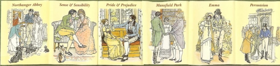
When Macdonald & Co. (London) published its first volume of Jane Austen’s work in 1948, Emma was the chosen work, with Philip Gough as illustrator. It was the 4thvolume in the Macdonald Illustrated Classics series. It is a small book, under 8 inches, bound in red leatherette, with a frontispiece and six full-page plates of watercolor drawings by Gough. There is no introduction. Macdonald published its next Jane Austen in this series in 1951 – Pride and Prejudice, with illustrations again by Gough and again no introduction. If you are lucky enough to have all the six volumes published by Macdonald, you will see that they appear to be a set, all with the same binding and all illustrated by Gough – but they were published over a period of years from 1948 to 1961 as follows – with the No. in the Macdonald series in ():
- 1948 – Emma (No. 4)
- 1951 – Pride & Prejudice (No. 23)
- 1957 – Mansfield Park (No. 34); introduction by Q. D. Leavis
- 1958 – Sense & Sensibility (No. 37), with Lady Susan and The Watsons; intro by Q. D. Leavis
- 1961 – Northanger Abbey (No. 40); intro by Malcolm Elwin
- 1961 – Perusasion (No. 41); intro by Malcolm Elwin
Not sure why Leavis did not do the other introductions – her essays on Jane Austen are magnificent, and a definite must-have for your Austen library. Her Mansfield Park introduction, after stating that MP is “now recognized as the most interesting and important of the Austen novels,” gives us a brief summary of Austen’s life and times, then writes of her theories that Lady Susan is the matrix of Mansfield Park, that Austen was “soaked in Shakespeare,” that the Sotherton sequence is one of the “most remarkable in any English novel” where all the action is symbolic and how its pattern of events is “exactly and awfully repeated” in the final outcome of the book, and finally how Mansfield Park is really a tragedy “in spite of the appearance of a happy ending.”
****************
There is little known about Philip Gough and I cannot find much researching the internet other than he was born in 1908, illustrated a number of children’s books, this Jane Austen series from Macdonald, and a goodly number of dust jackets for Georgette Heyer’s Regency novels.
But it is worth noting that in the introduction to the 1961 Persuasion by Malcolm Elwin (and also quoted by David Gilson in his entry E327 on this edition), Elwin states that the drawings of Hugh Thomson are said to be “too Victorian in their sentimentality to suit the spirit and period of the novels” – and that “Mr. Gough has shown himself a student of the Regency period, and many sound critics have judged him to have succeeded in conveying the subtlety of Jane Austen’s satiric humour.” Gilson also notes a TLS review of this edition (10 November 1961, 810), quoting that “Philip Gough’s illustrations have their own brand of sentimentality, this time of the pretty-pretty sub-Rex Whistler variety.”
Now I confess to having to google Rex Whistler, and find that there was an exhibition of his works at the Salisbury Museum in 2013: http://www.salisburymuseum.org.uk/whats-on/exhibitions/rex-whistler-talent-cut-short
Here is a Whistler drawing to better understand the “pretty-pretty” the TLS critic was referring to:
[Source: http://www.theguardian.com/artanddesign/2013/aug/25/rex-whistler-british-artist-exhibition ]
How easy it is to get off-track when researching!
–
Children’s literature: Gough’s illustrations for children’s works range from Alice in Wonderland for the Heirloom Library to Hans Christian Andersen’s Fairy Tales:
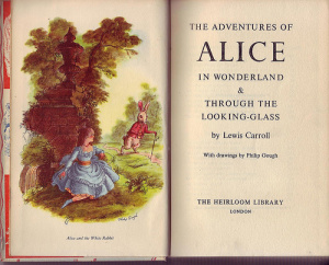
[Source: https://aliceintheinternet.wordpress.com/2010/02/03/alice-illustrated-by-philip-gough/ ]

[Source: Abebooks: http://www.abebooks.co.uk/servlet/BookDetailsPL?bi=14347377033&searchurl =an%3Dhans+christian+andersen+philip+gough ]
GoodReads has a starting list of books illustrated by Gough – this is not complete, as I find in a quick search on WorldCat a number of titles not listed, so if you know of others, please add to this GoodReads list!
********
Georgette Heyer: Philip Gough was one of Heyer’s favorite dust jacket illustrators (another was Arthur Barbosa) – you can see many of the jackets here.
But here are a few of your favorite Heyers – and clearly signed by Gough:


Illustrating Jane Austen:
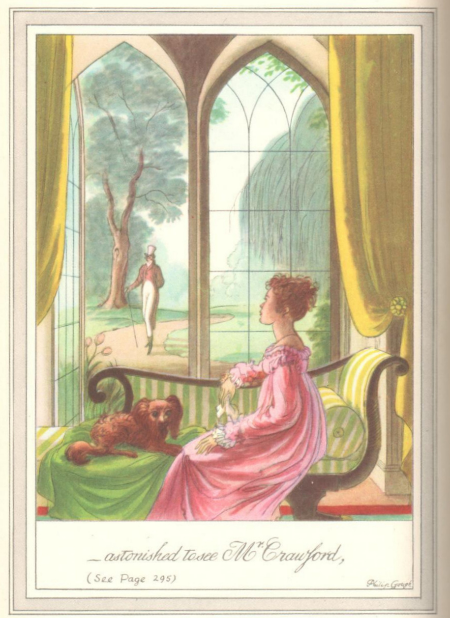
Gough’s watercolors for the Jane Austen novels have a tendency toward “Pretty in Pink” (as they do for Heyer) – indeed I have always looked rather wide-eyed at the abundance of Pink in his Pride and Prejudice – especially in this portrait of Mr. Darcy at the pianoforte…!

You can see all the Emma watercolors here, where again, and as evident in the Gough illustration opening this post, you see one dominant color – it seems that Gough equated the Regency period and Jane Austen with the feminine Pink! https://www.fulltable.com/vts/aoi/g/emma/a.htm
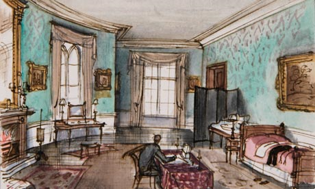
But now to our Mansfield Park, with Gough’s illustrations in the order as they appear in the book:


Now, go back and look at the illustrations and think about these questions [and comment below with your thoughts…]:
- Do the illustrations tell the story?
- Does Gough get the characters right?
- Why do you think the illustrator chose these scenes to depict? Would you have chosen other scenes?
- Do they give a sense of the time and place, the setting of MP?
- Does anything in the illustrations give a clue to Gough’s time rather than the time of the novel?
- Does Gough get anything really wrong?
- Do you have another illustrated edition of MP that you think conveys the story better than these??
Please leave a comment on any and all of these questions – I am interested in your thoughts and welcome the chance to hear from you as we end this year-long celebration of Mansfield Park!
Wishing all a Very Happy New Year!