It only seems fitting to end 2014 with a final nod to Mansfield Park. My intention of course had been to spend the entire year discussing the various illustrators of this novel over the past 200 years, but alas! such best intentions are all I have to offer up – so here is the first and final post on illustrating Mansfield Park!
[Source: StrangeGirl.com]
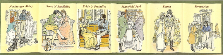
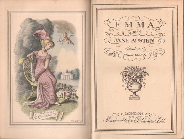
When Macdonald & Co. (London) published its first volume of Jane Austen’s work in 1948, Emma was the chosen work, with Philip Gough as illustrator. It was the 4thvolume in the Macdonald Illustrated Classics series. It is a small book, under 8 inches, bound in red leatherette, with a frontispiece and six full-page plates of watercolor drawings by Gough. There is no introduction. Macdonald published its next Jane Austen in this series in 1951 – Pride and Prejudice, with illustrations again by Gough and again no introduction. If you are lucky enough to have all the six volumes published by Macdonald, you will see that they appear to be a set, all with the same binding and all illustrated by Gough – but they were published over a period of years from 1948 to 1961 as follows – with the No. in the Macdonald series in ():
- 1948 – Emma (No. 4)
- 1951 – Pride & Prejudice (No. 23)
- 1957 – Mansfield Park (No. 34); introduction by Q. D. Leavis
- 1958 – Sense & Sensibility (No. 37), with Lady Susan and The Watsons; intro by Q. D. Leavis
- 1961 – Northanger Abbey (No. 40); intro by Malcolm Elwin
- 1961 – Perusasion (No. 41); intro by Malcolm Elwin
Not sure why Leavis did not do the other introductions – her essays on Jane Austen are magnificent, and a definite must-have for your Austen library. Her Mansfield Park introduction, after stating that MP is “now recognized as the most interesting and important of the Austen novels,” gives us a brief summary of Austen’s life and times, then writes of her theories that Lady Susan is the matrix of Mansfield Park, that Austen was “soaked in Shakespeare,” that the Sotherton sequence is one of the “most remarkable in any English novel” where all the action is symbolic and how its pattern of events is “exactly and awfully repeated” in the final outcome of the book, and finally how Mansfield Park is really a tragedy “in spite of the appearance of a happy ending.”
****************
There is little known about Philip Gough and I cannot find much researching the internet other than he was born in 1908, illustrated a number of children’s books, this Jane Austen series from Macdonald, and a goodly number of dust jackets for Georgette Heyer’s Regency novels.
But it is worth noting that in the introduction to the 1961 Persuasion by Malcolm Elwin (and also quoted by David Gilson in his entry E327 on this edition), Elwin states that the drawings of Hugh Thomson are said to be “too Victorian in their sentimentality to suit the spirit and period of the novels” – and that “Mr. Gough has shown himself a student of the Regency period, and many sound critics have judged him to have succeeded in conveying the subtlety of Jane Austen’s satiric humour.” Gilson also notes a TLS review of this edition (10 November 1961, 810), quoting that “Philip Gough’s illustrations have their own brand of sentimentality, this time of the pretty-pretty sub-Rex Whistler variety.”
Now I confess to having to google Rex Whistler, and find that there was an exhibition of his works at the Salisbury Museum in 2013: http://www.salisburymuseum.org.uk/whats-on/exhibitions/rex-whistler-talent-cut-short
Here is a Whistler drawing to better understand the “pretty-pretty” the TLS critic was referring to:

[Source: http://www.theguardian.com/artanddesign/2013/aug/25/rex-whistler-british-artist-exhibition ]
How easy it is to get off-track when researching!
–
Children’s literature: Gough’s illustrations for children’s works range from Alice in Wonderland for the Heirloom Library to Hans Christian Andersen’s Fairy Tales:

[Source: https://aliceintheinternet.wordpress.com/2010/02/03/alice-illustrated-by-philip-gough/ ]

[Source: Abebooks: http://www.abebooks.co.uk/servlet/BookDetailsPL?bi=14347377033&searchurl =an%3Dhans+christian+andersen+philip+gough ]
GoodReads has a starting list of books illustrated by Gough – this is not complete, as I find in a quick search on WorldCat a number of titles not listed, so if you know of others, please add to this GoodReads list!
********
Georgette Heyer: Philip Gough was one of Heyer’s favorite dust jacket illustrators (another was Arthur Barbosa) – you can see many of the jackets here.
But here are a few of your favorite Heyers – and clearly signed by Gough:


Illustrating Jane Austen:
Gough’s watercolors for the Jane Austen novels have a tendency toward “Pretty in Pink” (as they do for Heyer) – indeed I have always looked rather wide-eyed at the abundance of Pink in his Pride and Prejudice – especially in this portrait of Mr. Darcy at the pianoforte…!

You can see all the Emma watercolors here, where again, and as evident in the Gough illustration opening this post, you see one dominant color – it seems that Gough equated the Regency period and Jane Austen with the feminine Pink! https://www.fulltable.com/vts/aoi/g/emma/a.htm
But now to our Mansfield Park, with Gough’s illustrations in the order as they appear in the book:

Frontispiece


Now, go back and look at the illustrations and think about these questions [and comment below with your thoughts…]:
- Do the illustrations tell the story?
- Does Gough get the characters right?
- Why do you think the illustrator chose these scenes to depict? Would you have chosen other scenes?
- Do they give a sense of the time and place, the setting of MP?
- Does anything in the illustrations give a clue to Gough’s time rather than the time of the novel?
- Does Gough get anything really wrong?
- Do you have another illustrated edition of MP that you think conveys the story better than these??
Please leave a comment on any and all of these questions – I am interested in your thoughts and welcome the chance to hear from you as we end this year-long celebration of Mansfield Park!
Wishing all a Very Happy New Year!

Interesting post! I would have chosen the scene at the Ha-Ha or maybe the chapel. I’m sorry to say the only image I like is the one of Thornton Lacy and maybe the carriage one too. The figures appear too much “American Gothic” to my limited sense(and sensibility!!) of taste. The P&P one looks like the 1980 Darcy….who I strongly dislike. I don’t think they tell the story, nor get the characters right in my mind’s eye(sorry to be so negative!! Just woke up from a long winter’s nap…cracky much?). Too foppish? Dandyifed? Lol, I have read only one Heyer novel and didn’t like it.
Sarah Emsley will love this….”and finally how Mansfield Park is really a tragedy “in spite of the appearance of a happy ending.” I say morality, not tragedy. Happy New Year!!!!!!!
LikeLiked by 2 people
Thanks Kirk for visiting! – you are not being cranky, just as you say more like John Knightley! – I imagine him saying the same thing! – which Heyer did you read? – some are better than others but think you should try at least one more before completely writing her off your reading list… I’d suggest Faro’s Daughter or The Grand Sophy or Frederica maybe – have to think about that some more…:)
I don’t completely disagree with you – I do like these Gough illustrations, but also think they are a little bit too “sugary” for my tastes – I prefer the lightness and laughter that the Thomson illustrations generate, or the spot-on depictions of the Brock Brothers – but I do love the carriage image as you do too and he does get the clothing right despite the abundance of Pink, and draws a nice hessian!
Happy New Year to you as well Kirk!
LikeLiked by 1 person
It was Frederica that I read. The last 30-40 pages were better than the rest of the book. Lol, I was the only person who didn’t enjoy the book. Thx for the suggestions of the other two….maybe!
LikeLike
P.S. I’m a big fan of John Knightley….which makes me…..:)
LikeLiked by 1 person
…which makes you of course, Scrooge!
LikeLiked by 1 person
Dear Deb, you have chosen to write about one of my favorite Austen illustrators. I own two novels in this series and shared my images with Kali linked above. I must share that I discovered Whistler before Gough when I researched the 1936 Helen Jerome stage production of Pride and Prejudice. Whistler designed the stage sets and the program. When I acquired a copy of the Gough Mansfield Park, the similarity in style was very striking. Whistler had a short career because he died in WWII. He was also acquainted with the owners of Godmersham (Jane Austen’s brother Edward’s estate in Kent) in the 1930’s and painted a huge mural upstairs (which we were not permitted to see when our tour group was there last year (so close) and a family portrait with the manor house in the background. I would post an image of the P&P 1936 program if I could. Thanks for sharing the images. Are they from your copy, AND do you own the entire set???
LikeLiked by 2 people
Thanks for this info on Whistler, Laurel Ann – very interesting, especially the Godmersham connection! Sure proof of my belief (and yours!) that _everything_ leads back to Jane Austen! I saw that StrangeGirl’s images were from you and was sure that you had done a complete post on Gough but I could not find it searching your blog – would link to it if indeed you do have something on him, so let me know!
Yes, the MP images are from my copy – I have five of the Macdonald novels, lacking unfortunately the Emma, which I will likely forever be searching for… if you ever happen to see one, please tell me immediately!
Thanks for visiting, as always with more information to add further interest to any given topic on Austen!
Happy New Year to you!
LikeLiked by 1 person
Thanks for this lovely post, Deb. I hadn’t seen the Gough illustrations before and of course I’m glad to see QDL talking about MP and tragedy.
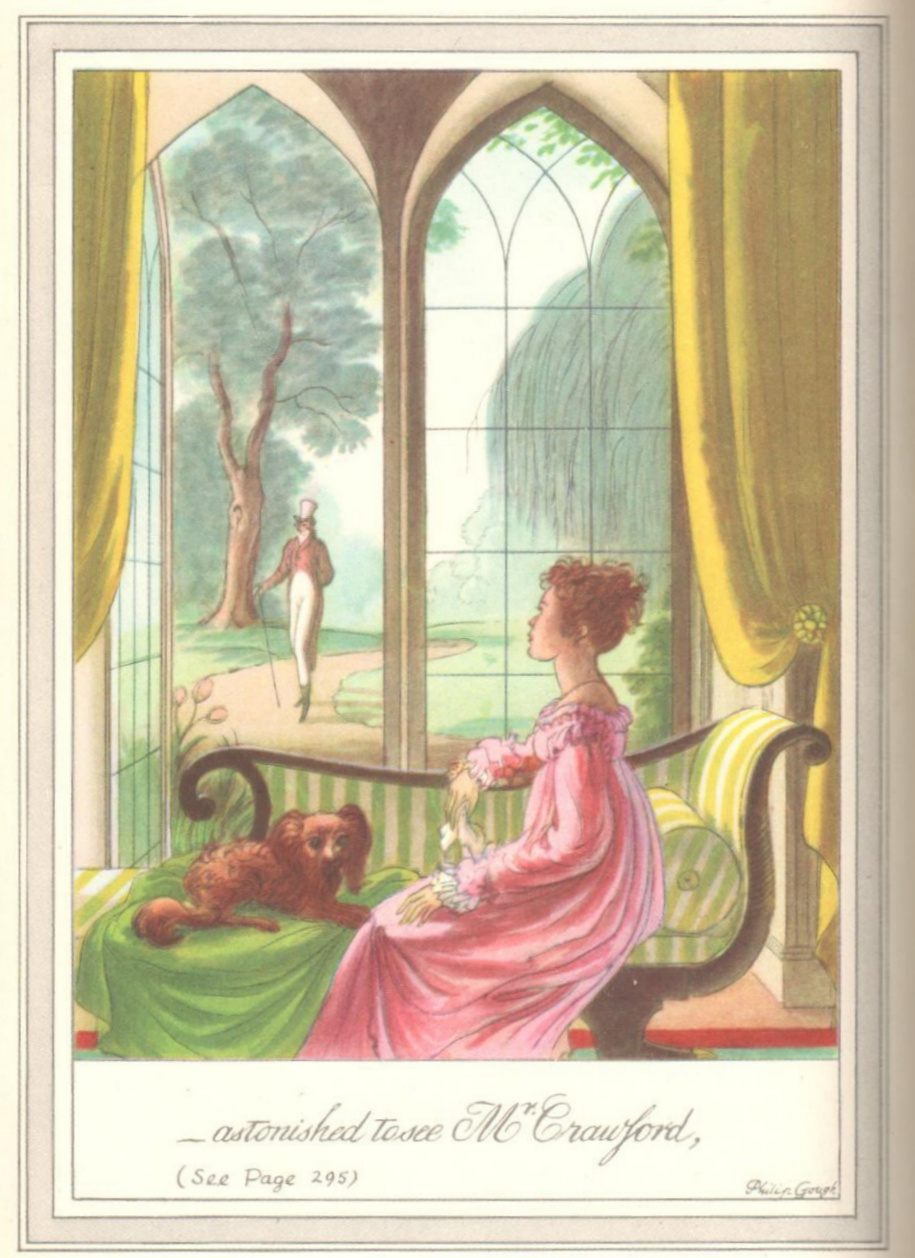
I don’t think the illustrations and phrases tell the story very well — big house; people in a carriage; someone wants to talk to Fanny; there’s Thornton Lacey; surprise! it’s Mr. Crawford; introductions are hard; now let’s sit under the tree. The Cozy Classics board books do a better job of telling Austen’s stories — it will be interesting to see which twelve words Jack and Holman Wang choose when they adapt MP. The Thornton Lacey caption should at least be “I told a man mending a hedge that it was Thornton Lacey, and he agreed to it.”
The illustrations from a distance are better than the ones with close-ups. I don’t much like the faces, especially Henry Crawford’s in the Portsmouth introduction scene. (What happened to “absolutely plain, black and plain”?) And Fanny’s face looks quite different in each illustration. I would have liked to see more of Mary Crawford, perhaps playing at Speculation. And where is “Lovers’ Vows”?
I wonder what Q.D. Leavis thought of the illustrations.
Thank you for all you’ve done this year to celebrate Mansfield Park, Deb, and Happy New Year to you, too!
LikeLiked by 2 people
Yes Sarah, I figured you were more than familiar with Leavis’s take on MP!
I agree that the images don’t tell the story well, but know you would agree with me that such a task would be harder for an illustrator of MP than any of the other novels. This book just needs more illustrations – and yes, one of Mary Crawford should be required! I thought it interesting that there is an abundance of Henry Crawford [he is the rider seeing Thornton Lacey], which I would think lead the reader astray as to the surprise outcome – perhaps Mr. Gough is of the school that feels that Fanny should have ended up with Henry?!
Thank you for all you have single-handedly done this year to generate interest in and abiding affection for Mansfield Park! I add a link here so anyone who missed them can go and spend some quality time on your blog!
http://sarahemsley.com/an-invitation-to-mansfield-park/
Happy New Year to you Sarah!
LikeLiked by 2 people
That’s very interesting that Henry appears so often. I definitely agree that MP would be harder to illustrate than the other novels, and that more illustrations would have helped Gough to tell the story better. Even if I could draw (which I can’t), I’m not sure which scenes I would choose to illustrate. I’m very curious to see what the Cozy Classics MP looks like. So many readers have objected that Austen doesn’t say enough to make it plausible that Fanny and Edmund marry. It is indeed a challenge to tell the same story in fewer words, or fewer scenes/images.
Thanks very much for the link to my “Invitation to Mansfield Park”!
LikeLike
First of all, thank you very much, Deb, for sharing these MP illustrations by Gough, when the Jane Austen Society of Ireland posted one on its site last year, I was very interested to see the rest of them.
Gough is not my favourite Austen illustrator, that spot belongs to the Brocks (as you can see from the collection at Molland’s) and I really wish Niroot Puttapipat could complete his set one day (MP and NA are sadly missing), but since there are not many Mansfield Park colour illustrations available, I like the ones by Gough well enough. More so, since, as you pointed out, he illustrated some Heyer covers which are also in my personal library (that’s where I first came to know about him).
Like others have said, they do not tell the story well, but I do not think they are meant to do that, they just depict some passages and not even the most interesting ones in the book, that ground had already been covered by Thomson and the Brocks IMHO. For me it is enough to have a couple of new passages illustrated.
The one I like best is the final illustration, with the cousins under the tree, it helps a little to ease my disconfort with the ending (sorry, Edmund has never been a favourite of mine). As shocking as it is, I am more a crawfordite (my favourite MP illustrations are the one where Henry helps Fanny with her shawl by Hugh Thomson and the one where he bids goodbye to Fanny in Portsmouth by Henry M. Brock) so I found Gough’s depiction of Henry lacking (I know, he is supposed to be plain and black).
About how many times, Henry appears in the illustrations, I think that might be the tendency for all ilustrators, it is not that they would have prefer the alternative ending, but it is because in general, Edmund (despite being described as handsome) is a dull character (his shining moments are very limited), whereas Henry is involved in most of the most crucial moments of the novel, which would be more interesting to illustrate.
I agree with Sarah, that a depiction of Mary is missing, if it were not for the mention of Fanny in the one titled “Can I speak with you, Fanny?”, I would have tought it was Mary, because I do not believe Fanny was taught drawing, and that one is the only illustration related to Lovers’ Vows if I am correct, when Edmund changes his opinion about playing (one of his lowest moments). I also would love to see an illustration depicting the Speculation game.
I do not know if Gough’s illustrations reflect his own time, for me it is enough that the characters are clad some kind of Regency clothes, but in general, they are not realistic, the bodies are rather stylized and not always in proportion to the settings and distances (observe the one about Thornton Lacy, where the horse and the rider seem smaller and thus farther than they should at the point where they stand on the road and in relation to the peasant), but then that was Gough’s style from what one can judge from the Heyer covers.
Another minor complaint in one of the illustrations is Pug, the little dog is not a pug, but it seems few illustrators get that one right.
For example, just last November was published an illustrated MP in Spanish, I have only seen samples of those new illustrations (by the Spanish artist Fernando Vicente). At first glance they attract the eye, but then you find some disconcerting details which I cannot find pleasant, but I know it is part of the artist’s style (he is interested in medical anatomic depictions). I am still uncertain about purchasing that edition.
I belong to the Brocks team :-).
LikeLiked by 1 person
They do tell of a story and they do give a sense of time and place…of long ago. I am fond of (http://www.abebooks.com/) as they carry a variety of books with illustration to do with many genre.
I am unsure if another illustration could provide a better one than depicted.
As always thank you for sharing.
LikeLike
Pingback: Collecting Jane Austen: Macdonald Illustrated Classics, illus by Philip Gough – Jane Austen in Vermont
Good morning, I have happened upon this old thread. if anyone is still there then Phili Gough was from a Place by Runcorn called Moore. The family lived in Moore House, Runcorn Road, where Cyril, his father was a poultry farmer. The 1941 farm survey records that he had 2700 chickens and 470 ducks. We understand that he bred them and that the young chickens were sent by local train to other farms to be raised for egg production. Philip was a book illustrator and around 1950 illustrated an edition of ‘Alice’s Adventures in Wonderland.’
LikeLike
Hello there – thank you for this info! I recently wrote more about Gough in this post: https://janeausteninvermont.blog/2021/08/15/collecting-jane-austen-macdonald-illustrated-classics-illus-by-philip-gough/ – and a friend of mine who knows more about Gough than I do is writing a guest post about him. I will pass on your info about the chicken farm to her! Thank you again for visiting!
LikeLike
Pingback: Guest Post: Philip Gough, Jane Austen Illustrator ~ by Hazel Mills – Jane Austen in Vermont