The Novels of Jane Austen. London: Chatto & Windus, 1908-09
[Source: Jonkers Rare Books]
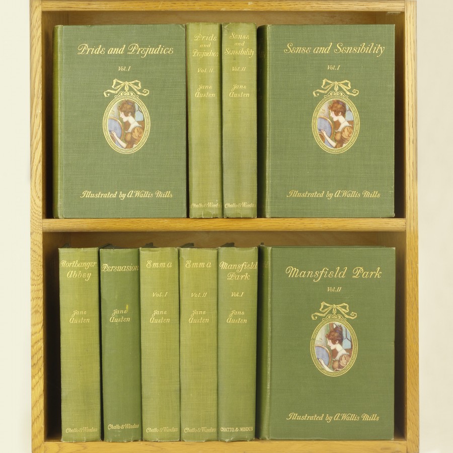
At number E117 in the Gilson Bibliography we find this 10-volume set listed with the following description:
“Printed by Arden Press, Letchworth. Olive green cloth gilt, with small oval colour illustration pasted down on each front board, endpapers [same in all volumes] reproducing a watercolour drawing by A. Wallis Mills, green dustwrappers printed in black. A general introduction and introductory notes by R. Brimley Johnson, title pages printed in blue and black, each volume has a frontispiece and nine other colour plates also by Mills [they plates do not always face the page specified in the illustration].
The volumes were available separately, or as a set bound in whole green parchment. Reissued in 1925 by George C. Harrap, London, bound in mid brown diagonal fine-ribbed cloth, otherwise identical with the original issue.”

So, I don’t actually have this full set, just the Persuasion volume, the one novel I focus my collecting energies on. I was doing a talk on illustrating Persuasion and wanted to have my own copy, and I broke all the rules of collecting to get it – I found it online, knew it was in terrible condition, but bought it anyway – it didn’t cost much and I wanted it for the illustrations and the endpapers. Alas!, it smells – so it is kept in its own place and not on the shelves with my other Persuasion copies – but, no regrets.
I am posting on this for a few reasons – because it is often the illustrated editions that are the most interesting and therefore the most collectible. And while we know our Brock and Thomson and Hammond editions, this set is not as well known.
A[rthur] Wallis Mills [1878-1940] was a British artist of mostly humorous subjects – he is famous for his cartoons and illustrations for Punch and The Strand magazines, and he illustrated more P. G. Wodehouse stories than any other artist.
You can see some of his Punch cartoons here: https://punch.photoshelter.com/gallery/Arthur-Wallis-Mills-Cartoons/G00006Xjyj6w34.8/
An inspiring example:
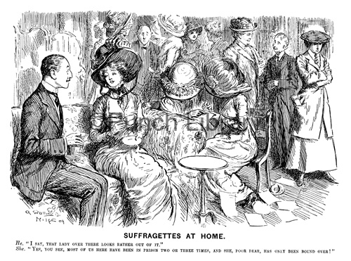
“Suffragettes at Home” for Punch Magazine, published 14 April 1909.
He: I say, that lady over there looks rather out of it’.
She: Yes, you see, most of us here have been in prison two or three times, and she, poor dear, has only been bound over!’
We might wonder why Chatto chose a political cartoonist to illustrate Austen – but at least we can give them credit for acknowledging her satirical wit.
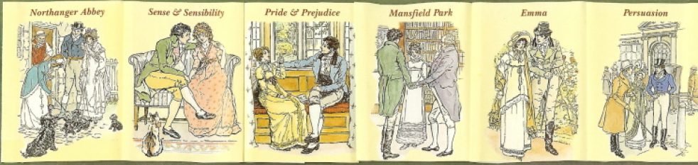
Here is a composite of a number of the illustrations across all the volumes:

A review of the two Sense and Sensibility volumes in the set appeared in The Literary Digest of October 1908, page 561, published by Duffield & Co., New York: the reviewer wrote:
“These two volumes in the new ten-volume set of Jane Austen’s writings, illustrated in colors by A. Wallis Mills, follow closely upon the publication of the first two, which contained “Pride and Prejudice.” Mr. Mills has caught the spirit of the original rather better in these volumes than he did in the other. His Mr. Darcey [sic] was not quite convincing, nor were his Miss Bennets, altho he was more successful with Mrs. Bennet—quite successful, in fact. In the present volume his Sir John is entirely satisfying and so are Mrs. Jennings and Mrs. Ferriar. We like immensely, also, his Dashwood girls. His picture of Mrs. John Dashwood’s arrival in her new home is entirely adequate. A more satisfying edition of Jane Austen is not known to us.”
[One can only assume the reviewer never saw a single Brock, Thomson, or Hammond!]
Here’s a larger image of the scene of Elizabeth in “earnest contemplation” of Mr. Darcy’s portrait – I cannot help but agree with the above reviewer’s opinion of Mr. Darcy:
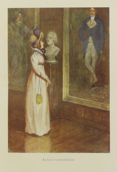
Though I find him a far better Darcy here:

***********************
What most interests me about these Mills illustrations is that the Austen illustrator Joan Hassall found them so distasteful, she did the unpardonable [in my view] with regard to a book: She writes, “Unfortunately, I could not like these pictures and spent a long time perseveringly tearing out about 50 coloured plates.” [JAS Report, 1973] – which means she left 50 intact – I wonder which ones! David Gilson calls them insipid! – these are very strong responses to poor Mr. Mills, and sure proof that the illustrations in a Jane Austen novel can either make or break the story for you.
Here are some examples from the set:
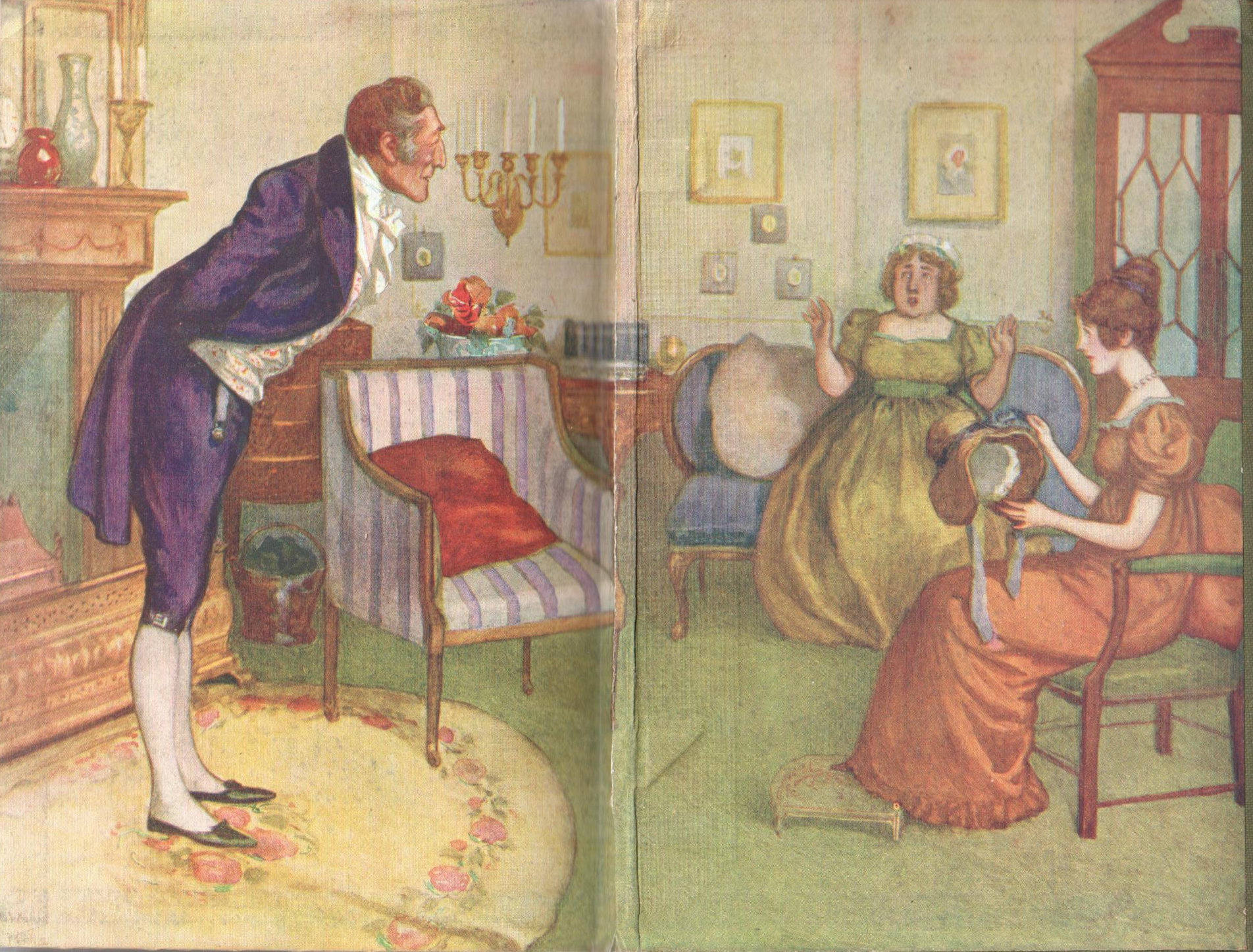
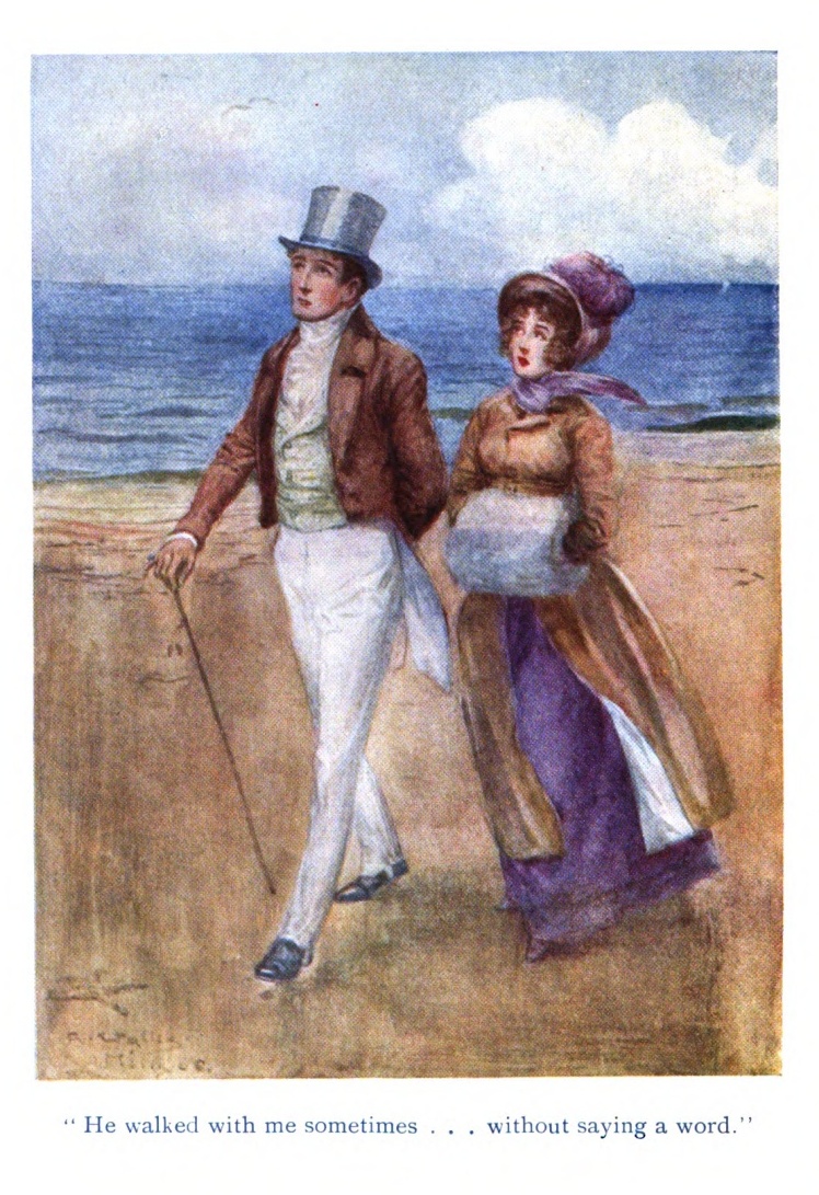
From Persuasion – here is the frontispiece, which makes no sense at all – it is the frontispiece, which should be a grand introduction to the book, and here we have Benwick and Mary Musgrove walking the beach at Lyme Regis – can you recall they even did this together?? Certainly no poetry conversation between them…
And this also from Persuasion of Charles Musgrove and Benwick “rat-hunting”: Musgrove a dead ringer for Prince Charles [and again, a rather odd scene to illustrate…]:

We must see Captain Wentworth or you shall never forgive me…he’s on the left looking rather disturbed… cramped “on the same sofa… divided only by Mrs. Musgrove, no insignificant barrier indeed…” and perhaps wondering why he ever left his ship…
I don’t find Mr. Mills’ attempts at giving us Austen’s humor in watercolor as awful as some – I do think they are a tad wishy-washy and far too-cute, but he is spot-on with the fashions and his humorous side is apparent, just maybe not as effective as Hugh Thomson? I do think you need to see all the illustrations from each volume to get the full effect, his comedy more subtle. They in some ways remind me of the 2013 Royal Mail postage stamps by Angela Barrett, where you can see the Persuasion scene is that of Mr. Elliot first spotting Anne on the Cobb:

You find these volumes often sold separately, and often in not great conidtion [be sure to check for those 10 illustrations in each volume!] – full sets appear infrequently and might run to $1000 or more depending upon condition.
Thoughts anyone? Would you cut these illustrations out of your set [thereby making it worthless], or call them insipid??

I’m not crazy about the illustrations, but love that you have introduced them to me, as I have never seen them. The set of books, with their spring green covers, are lovely. Thanks for sharing!!
LikeLike
Yes, I think the covers might be the best thing about them! I do think there is a cartoonish quality to the illustrations, and wonder why they don’t work as well as the Thomson ones which can have a similar quality of caricature. Thanks for stopping by!
LikeLike
I am rather ambivalent about them, Deb. The illustrations just do not sing to me. That image of Darcy is just dour. The similarity between them and the 2013 Royal mail stamps is remarkable, though I am not wild about them either. I do appreciate your featuring these editions, though. I cannot imagine paying $1,000.00 for the set, though. I am for Chris Hammond and a bit more emotion any day.
LikeLike
“Ambivalence” is the perfect term Laurel Ann! Agree that Darcy is dour – but I think Mills might have gotten that one nearly right – he IS dour when first coming on the scene! I do see them coming up for sale as 2 volume sets, as each novel has 2 volumes, with NA and P having their own. They were also originally published separately and why finding a complete set is not that common. $1000 is not that much really if you are a completist – it would just help to actually love the illustrations!
LikeLike
I always think illustrators create characterisations that appeal to the time they are making them for Deb. Imagine an illustrator today painting characters like the above? The film versions do it for us. Talking about interpreting characters for ,”the time.” the recent portrayals in the recent Emma I could meet at any Glastonbury Festival.
LikeLike
Yes Tony – you are correct and why the earliest Austen illustrations are all wrong for the Regency period, filled with Victorian fashions and décor. Some of the more recent illustrators get much right, but even so there is an element of 20-21st century in it all. Check out Niroot Puttapipat – you’ll see that his works are perfectly rendered for the Regency times, but also they look more like some of the recent film adaptations… Any illustrator brings their own times and sensibilities to their work whether they intend it or not…
LikeLike
Hi Deb,
Very late coming to this post. My husband found 8 volumes for me in an Emaus charity shop just outside Cambridge at a very small price. Sadly I am missing Pride and Prejudice, but live in hope! I quite like these illustrations, much better than some I possess! Thanks for the great article.
LikeLike