So I am back from an RV trek up north – finally able to get to Vermont and visit with family and friends – almost SEVEN weeks with no stable or reliable internet connection on any given day – and I actually survived the deprivation. Thankfully Trooper was not writing his usual journal of this trip [ https://trooperslog.wordpress.com/ ] so did not need to be uploading all his commentary and pictures every day.
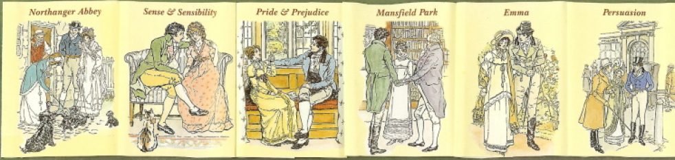
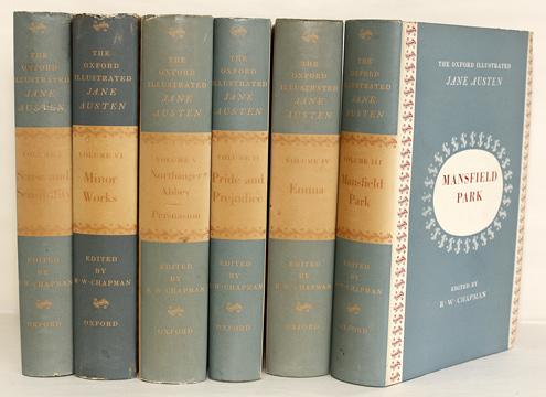
But now back home with access to my shelves and resuming posts on “Collecting Jane Austen” with a short post on one of my favorite sets of Jane Austen’s novels: The Macdonald Illustrated Classics (London, 1948-61), with illustrations by Philip Gough and introductions by various scholars for four of the six volumes.

I have written about this set before, and so direct you to that blog that focused mostly on Gough’s illustrations for Mansfield Park: https://janeausteninvermont.blog/2014/12/30/jane-austens-mansfield-park-in-pictures-the-illustrations-of-philip-gough/
I’ll repeat here the description of the set:
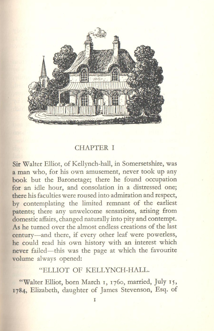
When Macdonald & Co. (London) published its first volume of Jane Austen’s work in 1948, Emma was the chosen work, with Philip Gough as illustrator. It was the 4thvolume in the Macdonald Illustrated Classics series. It is a small book, under 8 inches, bound in red leatherette, with a frontispiece and seven other full-page plates of watercolor drawings by Gough. There is no introduction. Macdonald published its next Jane Austen novel in this series in 1951 – Pride and Prejudice, with illustrations again by Gough and again no introduction. If you are lucky enough to have all the six volumes published by Macdonald, you will see that they appear to be a set, all with the same binding and all illustrated by Gough – but they were published over a period of years from 1948 to 1961 as follows – with the No. in the Macdonald series in ():
- 1948 – Emma (No. 4)
- 1951 – Pride & Prejudice (No. 23)
- 1957 – Mansfield Park (No. 34); introduction by Q. D. Leavis
- 1958 – Sense & Sensibility (No. 37), with Lady Susan and The Watsons; intro by Q. D. Leavis
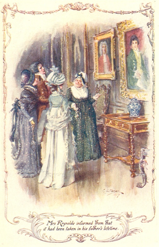
- 1961 – Northanger Abbey (No. 40); intro by Malcolm Elwin
- 1961 – Perusasion (No. 41); intro by Malcolm Elwin
Not sure why Leavis did not do the other introductions – her essays on Jane Austen are magnificent, and a definite must-have for your Austen library. Her Mansfield Park introduction, after stating that MP is “now recognized as the most interesting and important of the Austen novels,” gives us a brief summary of Austen’s life and times, then writes of her theories that Lady Susan is the matrix of Mansfield Park, that Austen was “soaked in Shakespeare,” that the Sotherton sequence is one of the “most remarkable in any English novel” where all the action is symbolic and how its pattern of events is “exactly and awfully repeated” in the final outcome of the book, and finally how Mansfield Park is really a tragedy “in spite of the appearance of a happy ending.”

All of the novels were published with a stiff clear mylar wrapper with the title and “Illustrated by Philip Gough” in mustard yellow, and “By Jane Austen” in blue, with nothing on the spine but the gilt titles on the red backstrip showing through. These wrappers are nearly impossible to find. I only have the one for my Emma volume.
****************
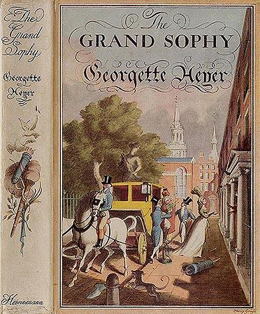
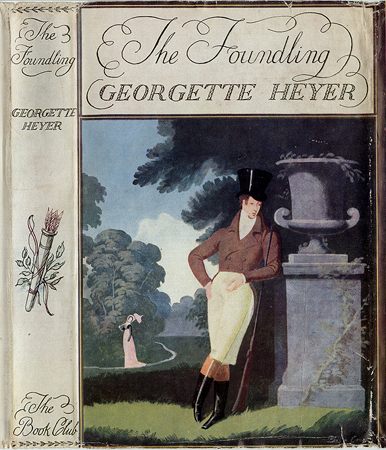
There is little known about Philip Gough and I cannot find much researching the internet other than he was born in 1908, illustrated a number of children’s books (Alice in Wonderland, Hans Christian Andersen’s Fairy Tales are two examples); this Jane Austen series from Macdonald; and a goodly number of dust jackets for Georgette Heyer’s Regency novels (see below). There is a list of 14 books on Goodreads illustrated by him but this list is not complete – Jane Austen is not listed!)
[ https://www.goodreads.com/author/list/1981672.Philip_Gough ]
It is worth noting that in the introduction to the 1961 Persuasion by Malcolm Elwin (and also quoted by David Gilson in his entry E327 on this edition in his A Bibliography of Jane Austen), Elwin states that the drawings of Hugh Thomson are said to be “too Victorian in their sentimentality to suit the spirit and period of the novels” – and that “Mr. Gough has shown himself a student of the Regency period, and many sound critics have judged him to have succeeded in conveying the subtlety of Jane Austen’s satiric humour.” Gilson also notes a TLS review of this edition (10 November 1961, 810), quoting that “Philip Gough’s illustrations have their own brand of sentimentality, this time of the pretty-pretty sub-Rex Whistler variety.”
[Source: http://www.theguardian.com/artanddesign/2013/aug/25/rex-whistler-british-artist-exhibition ]
*********************
Illustrating Jane Austen:
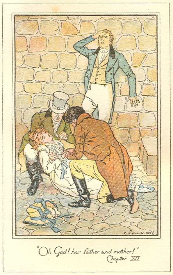
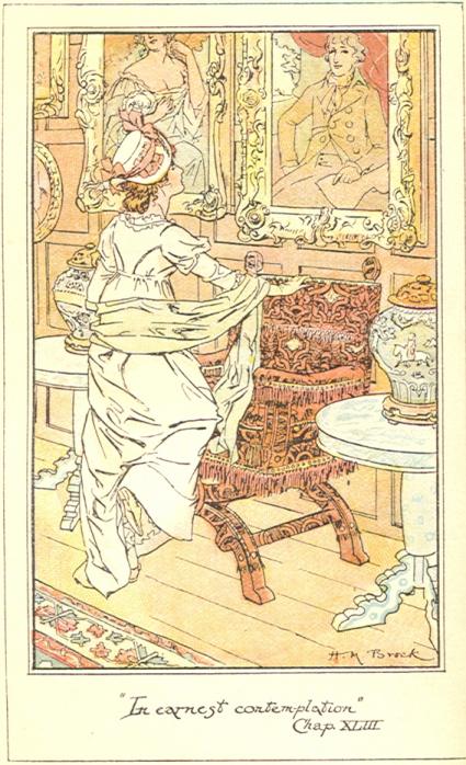
Each of the novels begins with a chapter I heading drawing in black and white as well as a drawing on the title page. Emma as the first published of the novels is an exception – there are chapter heading illustrations for each of the odd-numbered chapters; all the other novels have only the one heading chapter I as well as the title page. Each novel has 7 watercolors (Sense and Sensibility only has five; there is one watercolor each for Lady Susan and The Watsons and each begins with a black and white drawing.) I find these watercolor illustrations a little too precious – there is a tendency toward “Pretty in Pink”– as you will see in these examples from each novel in the order of publication below. There is also some rather odd scenes of what Gough chose to illustrate and they are often placed so far from the actual text being quoted that they serve more as a distraction rather than illuminating the story. But these are quibbles – I love this set and am privileged to have it on my shelf – it is almost impossible to find as a full set, and each volume can be quite expensive when located (Emma is the most elusive) – my advice is to buy them when you see them and grin and bear it.
So now for a few examples of Gough’s illustrations from each of the novels:
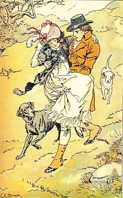
Emma (1948): Gough definitely equated the Regency period and Jane Austen with the feminine Pink – and in Emma there is a good deal of it!
You can see all the Emma illustrations here, including two of the many chapter headings: https://www.fulltable.com/vts/aoi/g/emma/a.htm


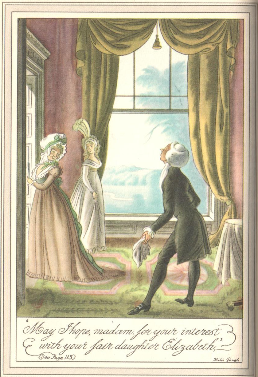
Pride and Prejudice (1951): I have always looked rather wide-eyed at the abundance of Pink in Gough’s Pride and Prejudice – especially in this portrait of Mr. Darcy at the pianoforte…!

And we must include Gough’s simpering Mr. Collins:
****************
Mansfield Park (1957): here is one example, but as noted above you can see all seven illustrations here: https://janeausteninvermont.blog/2014/12/30/jane-austens-mansfield-park-in-pictures-the-illustrations-of-philip-gough/

Sense and Sensibility (1958):

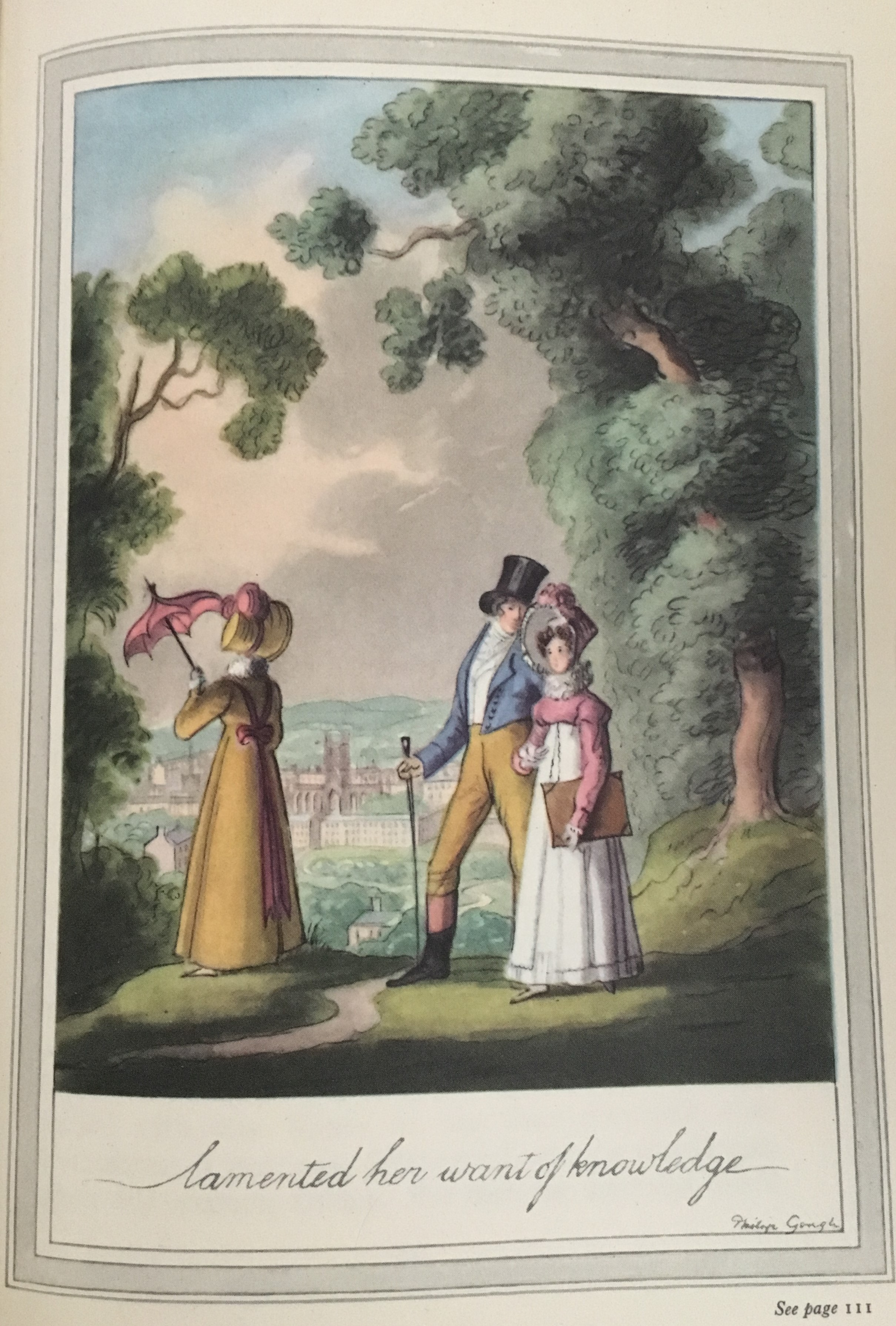
Northanger Abbey (1961):
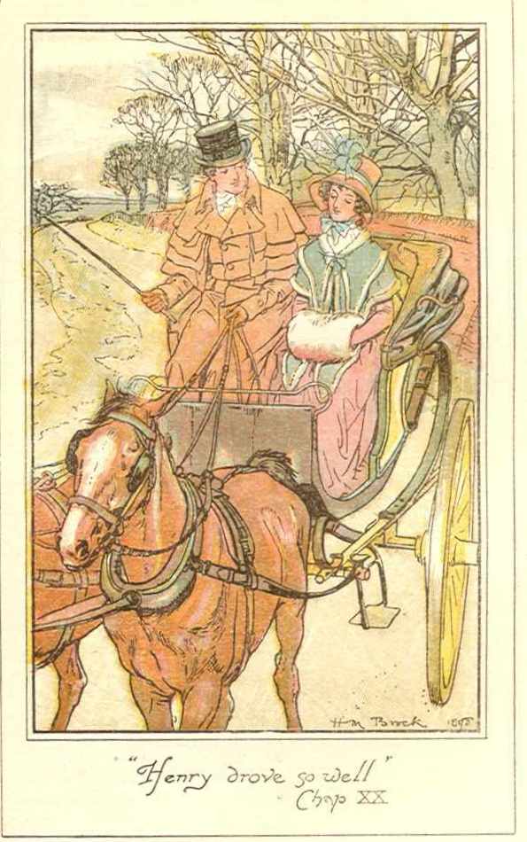
Persuasion: (1961)
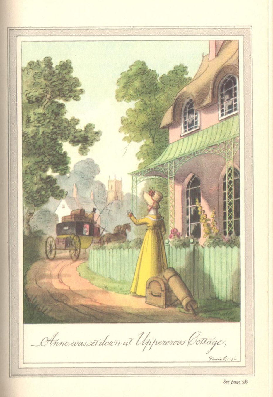
Chapter heading from Ch. I of Persuasion: you would think this should be Kellynch Hall at the start of the novel – but this is certainly not grand enough for Sir Walter! We find on page 42 that it is Uppercross Cottage and here we see it in full color:
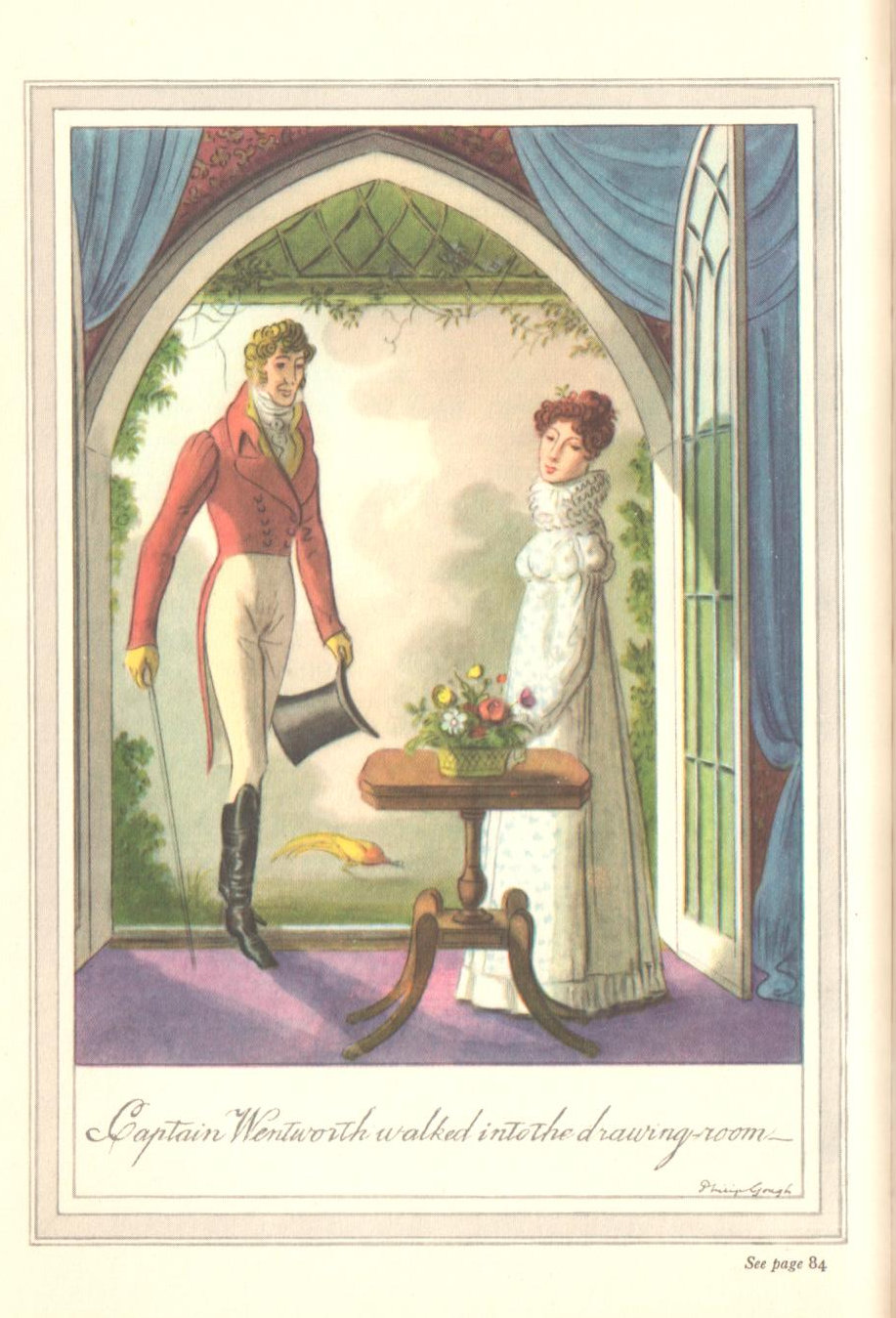
We shall end with Captain Wentworth, because, why not – we see him neither in a navy uniform (this is for another post – how many illustrators portray the good Captain in uniform??), nor is he in Pink, but an odd color nonetheless!
******************
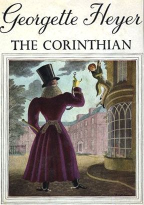
Gough cover illustrations for Georgette Heyer – some examples (I LOVE these!):
Do you have a favorite Gough illustration??


 Newly republished by Moonrise Press (Ludlow, England), author Penelope Byrde’s book on fashion is now in its second regeneration. Initially published in the 70s as A Frivolous Distinction, it found a new lease on life in an expanded edition put out by Excellent Press in 1999. It has now been rescued from its consignment to used bookstores (if you were lucky enough to find a copy) by this paperback edition. May Moonrise Press profit from its belief in the continuing interest in this subject – fashion not only in Austen’s day but, more precisely, in Austen’s own life.