Of all the Jane Austen sets, this Dent publication is probably the most well-known because of the Brock brothers illustrations – they have continued to be published over and over again, and the ones we think of when we think of “Jane Austen illustrated.”

The Novels of Jane Austen, J. M. Dent, 1898 [Molland’s]
1892 was a watershed year for Austen and the beginning of the many Dents – but today we will focus on this set published by J. M. Dent in 1898 in 10 volumes and edited by R. Brimley Johnson – it was the first to offer Jane Austen in color. You can find all the interesting information in Gilson at E90. But a quick summary and a few pictures will surely entice you to want this on your shelves – and if the set is hard to come by or beyond your price range, a fine adventure is trying to put a set together yourself, as individual volumes are often available.
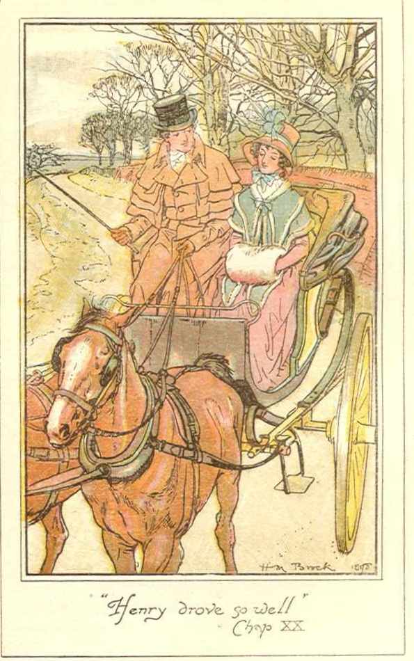
Dent had originally published Austen’s novels in 1892, also edited by Johnson, but with sepia-toned illustrations by William C. Cooke [more on this set in another post]. But in 1898, Dent used the same text plates but deep-sixed the Cooke illustrations and took on the Brock brothers to render Austen in livelier watercolors reproduced by 6-color lithography with each volume having 6 illustrations. Charles Edmund Brock did Sense & Sensibility (vols. 1 and 2), Emma (vols. 7 and 8), and Persuasion (vol. 10). Henry Matthew Brock did Pride & Prejudice (vol. 3 and 4), Mansfield Park (vols. 5 and 6), and Northanger Abbey (vol. 9).
[You can read about the Brocks here at Molland’s with an excellent essay by Cinthia García Soria here: http://www.mollands.net/etexts/other/brocks.html ] You can also google their names and many of the Jane Austen blogs have posts on the Brocks and other illustrators.


The Brocks owned a number of Regency era furnishings and decorative arts, as well as a large collection of fashion prints – they had many costumes made, having family and friends model for them and perhaps why their illustrations seem so very authentic! Laura Carroll and John Wilshire call these Brock-illustrated editions “Chocolate-box” – gift-book quality, beautiful inside with delicate pen or brush drawings, and outside with gilt embossing and Arts and Crafts inspired design; another critic refers to the Brocks’ work as “delicate teacup and saucer primness”! [See their essay “Jane Austen, Illustrated” in A Companion to Jane Austen, Wiley-Blackwell, 2012, pp. 62-77.]
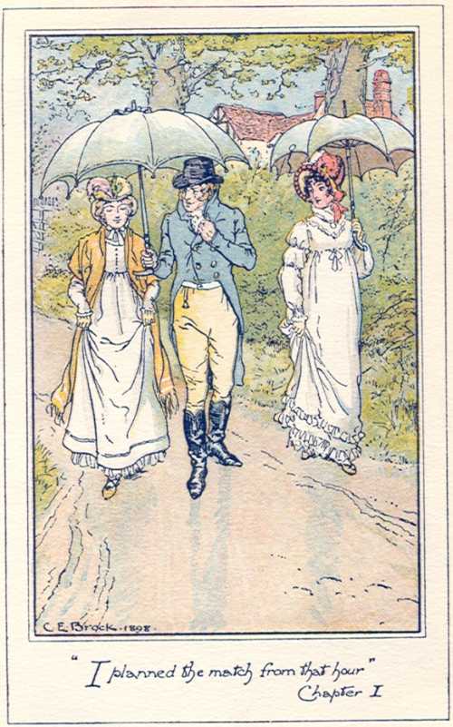
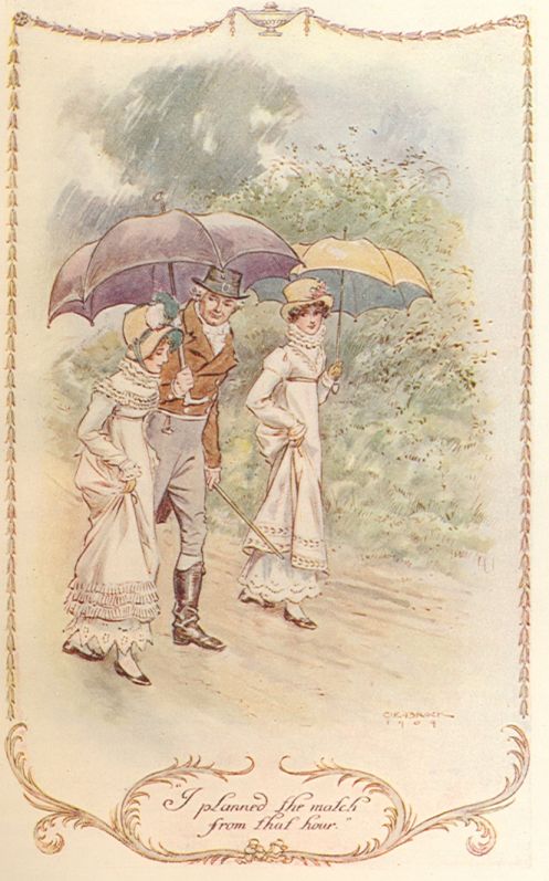
C. E. Brock had previously illustrated Pride and Prejudice with black and white line drawings – this was published by Macmillan in 1895. He would go on in the years 1907-09 to illustrate all the novels for another Dent publication, their Series of English Idylls (with 24 watercolor illustrations in each volume; they were all later published as a set with fewer illustrations in each volume.) To compare CE Brock’s two very different styles in these two editions is an interesting way to spend at least an afternoon! Here is one example from Emma, the infamous romance-inducing umbrella scene:
******************
To follow all the wild publishing of Austen at the end of the 19th century and the beginning of the 20th requires a degree in bibliography, or at least a great deal of patience – and certainly you must have Gilson by your side. There were many, many reprints with many variations as to the number of illustrations, the quality of the reproductions, and binding types – it is great mess for the book buyer / collector – and all I can say is do your homework and buyer beware…!
American printings are another great mess, various publishers over a span of years, with varying number of illustrations, and in many cases a poorer reproduction quality. The most important thing to remember is that the earliest edition will have the higher price but also better quality printing and illustrations. As an example, compare these HM Brock 1898 and 1907 printings of Darcy giving Elizabeth his letter in Pride & Prejudice:

[this doesn’t show up very well in the scan – but there is a huge difference in the detail, color, and quality of the print]
Here are a few illustrations: I have various volumes and parts of the green cloth 1898 set, but also this 1898 set bound in leather – this one my favorite, but alas! it is missing something very important!

Dent 1898 – red leather – my set, lacking the all-important what? P&P!
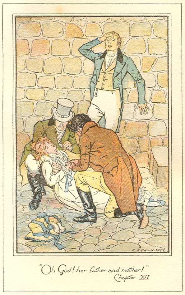

CE Brock, Persuasion, 1898:
The Fall! / The Letter!

********************
Compare:
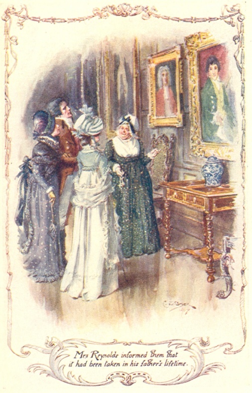
One of my favorite scenes in Pride & Prejudice is Elizabeth “in earnest contemplation” – here we can see CE Brock’s line drawing for Macmillan in 1895 and HM Brock’s in 1898, and CE Brock’s in 1907 [are you sufficiently confused yet??]

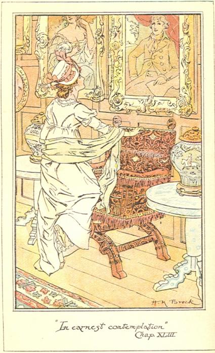
CE Brock, Macmillan, 1895 / HM Brock, Dent, 1898
CE Brock, Dent, 1907 [though this is not exactly the same quote you get the idea…]
*************
You can see the many Brock illustrations for the various editions of each novel by visiting the amazing Molland’s here: http://www.mollands.net/etexts/
******************
The Brocks are most often compared with Hugh Thomson: there are various critical interpretations of these two most popular Austen artists, some more approving of Thomson’s humor and his almost caricatured characters, while others preferring the more effective facial expressions and body language of the Brocks that seem more realistic despite the rather overdrawn borders and settings – do notice the detail in the fashion, the furnishings, and landscape, and what scenes are chosen – we can compare these to Thomson in future posts. The point is, you need them both…
Mr. Knightley on his horse


Hugh Thomson, Emma, Macmillan, 1896 / CE Brock, Emma, Dent, 1898
********************
Stay tuned for a post on Hugh Thomson and his several Jane Austen editions – in the meantime, tell me your favorite of the Austen illustrators – I haven’t posted about mine yet…

Thus just popped up for me, a bit late, but better late than never. I love the Brock illustrations. I used to frequent David’s Bookshop in Cambridge to buy Austen volumes I could afford and caress those I couldn’t! The shop began life as a market stall and I was told that the Thomson Peacock Edition was sold on the market for one shilling (5 pence now) but Brock illustrated books were two shillings because they were Cambridge artists!
LikeLike
Do you know if there are any re prints or versions with the of the 1898 dent illustrations? I really like the illustrations and would love any copy of pride and prejudice with those illustrations be it the 1898 or 2022
LikeLike